Pages

Thursday, August 23, 2012

What's so Great About GDP Growth if We're Not Building Wealth?

I'm going to be traveling for a bit until after labor day, so this will be my last post until then.  Sorry to leave everyone with a rant, but I think this is an important concept worth pondering.

One of the main reasons that our economy feels so stagnant is that our economic policies are focused on maximizing the wrong economic indicator.  We fixate on GDP growth, when in actuality this is the second derivative of what really matters for economic well being: wealth.

Wealth is most important because wealth is the key determinant of how much one can consume.  Wealth is distinctly different from income.  A person with a high net worth and no income is generally better off than a person with a high income and no net worth.  Income is important because it controls the pace at which wealth growths, but our ultimate economic goal as individuals is maximization of wealth and by extension, consumption.

In an economic sense, GDP is an income measure (even more accurately a revenue measure).  As an income measure, GDP itself (i.e. $15T) is the growth measure.  If all of GDP were saved in a year, wealth would grow by $15T per year.

As a society we follow GDP, but we are even more concerned with GDP growth (for example 3%).  This is mostly misguided because it is the second derivative of what we actually should care about.  GDP growth measures the pace at which the growth of your wealth is growing.  It is an acceleration measure.

In physical terms, wealth, GDP and GDP growth are akin to position, velocity and acceleration.  If you are trying to reach a destination, who cares if you are going fast and headed faster in the wrong direction?

If our intended economic destination is the maximization of wealth, we as a society have been failing miserably.  The charts below measure the aggregate net worth of US households: Assets-Liabilities.  Two major factors are left off of the headline number which are added back into these charts:  1) Federal Government Debt, which Ricardian equivalence argues is a direct liability on the household balance sheet 2) Inflation adjustment.

When one adds government debt and the declining value of the dollar back into the picture, the outcome is bleak.  There has been no increase in real household net worth since 1999.  If one adjusts the chart further for a per capita number it takes real household net worth back to 1997 levels.  Worst of all if we include the very real but unfunded liabilities of Social Security and Medicare (someone has to pay for these programs if not the government), household net worth all but vanishes.  

We have been failing to increase wealth because our economic policies have been designed deliberately to destroy it in order to pursue GDP growth.  Low interest rates and large deficits are policies that force more debt and inflation in order to generate GDP growth.  These policies can stoke economic activity, but do so in a way that directly restricts the accumulation of wealth by actively combating what has already been saved.  Negative real interest rates are by definition wealth decaying.  Debt wasted on an unproductive asset is similarly harmful to net worth.  The above chart implies that over the last 12 years these wealth destructive policies have wiped out all of the GDP produced during the period.  Thus our aggregate net worth has remained flat.

Our current policies are the equivalent of declaring economic war on one's self--like tearing down a perfectly good home in order to rebuild it.  The rebuilding of the home contributes to GDP for the period, but did it make the dweller any better off?  Destroying and rebuilding valuable assets doesn't increase wealth it destroys it.

Why do we as a society continue to push our foot to the gas pedal trying to go as fast as we can in the wrong direction?  What is the value of producing one more widget per year if we destroy two saved widgets in order to do so?  When will these destructive and misguided economic policies end? Sadly, it probably wont be with any official running for office today.


Toll Brothers Market Cap Per Housing Starts

With growing consensus that the housing market has finally turned from the bottom, home builder Toll Brothers' stock has seen a huge rally of late.  Year to date TOL is up 62% and its market cap is now $5.5B.  That's still $3B below its peak in 2005, but housing starts also peaked at over 2 million back then.  Today housing are only 746k.

Below is a comparison of TOL's market cap relative to aggregate housing starts.  The analysis ignores changes in market share, but should give a rough sense of what the stock is forecasting.  For TOL's market cap/housing start ratio to go back to the $800 it was at in 2002, housing starts would mathematically have to rise to nearly 7 million, which is definitely not happening.  If housing starts returned to 2 million, which is also far-fetched, TOL would sell for ~$2,750 per aggregate start--still above where the ratio held in 2002-2004.


Wednesday, August 22, 2012

Apparently the Japanese Trade Deficit Was Because of "Illegal Sanctions on Iran"...

In searching for data on Japan's trade deficit, I found a headline worth reposting from the Tehran Times.  Sometimes you have to love the humor provided by state controlled media...


From the article:
Japan has turned to fossil fuel alternatives and increased its energy imports after its nuclear reactors were shut for safety tests following last year’s crisis at a nuclear power plant in Fukushima. 
Earlier in the month, former Japanese Prime Minister Yukio Hatoyama told Press TV that his country is paying a high price for the illegal US-led oil sanctions against Iran. 
Crude prices have been increasing following the illegal sanctions on Iran’s energy sector and the persisting Israeli publicity campaign of threatening unilateral military strikes against Iran.


What Percentage of the US Population Works?

Below is a chart of the employment/population ratio for the US.  It measures the percent of the population in the US that is working.  Even though the unemployment rate is 8.2%, that only measures those looking for work who can't find jobs.  The number below takes into account the whole population.  At 58% of the population employed, the number is the lowest it's been since 1984.  The employment ratio for men is near an all time low set in 2010.


Still, compared to some other developed countries the percentage of the US population that is working is relatively high.  In Italy, less than half the population is employed.


Tuesday, August 21, 2012

What is the Law of Large Numbers Actually?

The following is a rant.  If you are easily annoyed by meaningless semantic arguments feel free not to pay attention.

Since Apple became the largest company of all time, "law of large numbers" seems to have become a CNBC buzzword.  It's clear from the context of the conversations that the term is being used to argue that it's difficult to continue to grow at a high pace from a large base, but that's not really what the "law of large numbers" is about.  The law of large numbers is a statistical term that says that the more samples you take of a population, the closer the mean will accurately represent the mean of the population.

From Wikipedia:
In probability theory, the law of large numbers (LLN) is a theorem that describes the result of performing the same experiment a large number of times. According to the law, the average of the results obtained from a large number of trials should be close to the expected value, and will tend to become closer as more trials are performed.
This seems to be a slightly different concept than the idea that "Apple's market cap can only get so big before it falls."

Maybe it would be better to specify that Apple could succumb to the "law of large market values." After all, the limit of Apple's market cap doesn't have anything to do with the limits of numerology.  There's nothing that says that the number 1 billion cant increase to the number 1 trillion or more.  The constraints on Apple's market cap are driven by the size and penetration of its end markets.  If there were a company that had a monopoly on Oxygen, it's reasonable to assume that it could have a much higher market capitalization than Apple.

Apple Reversal Days 2012

Apple's intraday bounce off of the $675 level doesn't have to mean a whole lot, but since the company is now almost 20% of the Nasdaq, I figured it might be worth looking at other times that the stock has had a big intraday reversal like it had today.

Back in April, when the stock had its last relative peak, the  peak came on a day just like today where it traded up in the morning and lower by close.  However, there were two other big reversal days (highlighted below) in February on little news and March when it bounced off of the $600 level.  Neither of those days (like the thousands of days before them) signaled that the stock should be sold.


TLT Nearing S&P 500 Drawdown

Are bonds always less risky than equities?  If TLT's recent move teaches investors anything the answer should be an emphatic no.  Earlier this year the S&P 500 saw a drawdown (top to bottom loss) of ~10%.  Over the last month TLT, an ETF matching the return of long term US treasuries, has lost nearly the same amount as interest rates have risen.  The moral of the story:  holding duration on the long end of the curve can create equity like returns and equity like volatility.


Gold Hitting Seasonal Tailwind

Gold is up more than 1% today, which is the first day in a long time that the metal has had notable outperformance relative to the S&P 500.  While gold has moved sideways for most of the year and is only up 4.5% year to date, we are soon entering a time of year that has historically been pretty favorable  for gold bulls.  The favorable seasonality is said to be driven by the Indian harvest/festival season when farmers spend profits on gold.  India was having drought problems of its own earlier this year, but has since seen a nice recovery in rainfall.  Diwali on.


Monday, August 20, 2012

How Good is the VIX at Forecasting Future Volatility?

UPDATE: There was an error in the way I annualized the VIX in the original post leading to a different conclusion.  The error should have been corrected below.

According to those who believe in efficient markets, market based prices should be reliable indicators of future events.  If the efficient market hypothesis holds true, then the VIX should be a reliable predictor of future stock market volatility.  Is it?

The VIX is supposed to forecast the 30 day future volatility of the S&P 500.  Below is a chart of the VIX against a chart of the actual realized volatility 30 days from the time of measurement of the VIX.  On average, the VIX has expected a slightly more volatile environment than has been realized over the last 8 years.  The average difference between the VIX and actual volatility in this period was about 3.25%.


How Much has Volatility Fallen?

As the VIX has fallen to multi-year lows over the past several trading sessions, the S&P 500 continues to trade in a very narrow daily range.  The average daily (absolute value) change in the S&P 500 is nearing lows of its own at +/- 0.55%.

Although the VIX is supposed to be a forward looking indicator, it is highly correlated with recent history.  It rises and falls in lockstep with what has happened over the previous 30 days.


Thursday, August 16, 2012

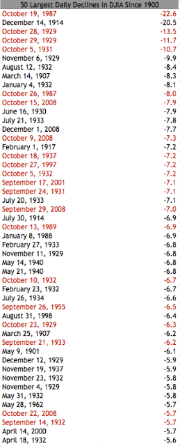
50 Largest Single Day Drops in Dow Jones

Earlier this year, after the S&P 500 put up one of its best 1Q's of the last 50 years, I posted that in 9 out of 10 years that the S&P had a double digit first quarter, the index closed the year even higher.  The only time that it didn't was in 1987 because of the infamous market crash that happened in October of that year.

While the probability is much stronger that a 1987 like event will not occur, if one did it's possible that it would happen in the next 75 days.  Historically volatility tends to pick up in late September and October.  Below is a list of the 50 largest single day drops in the Dow since 1900.  Twenty out of the fifty, or 40%, happened between September 14th and October 29th.


Best Performing S&P 500 Stocks Since March 31

The S&P 500 is just 5 points away from its year to date high that was hit on April 2.  While the road since April 2 has been far from smooth, there are some stocks that have sailed through unscathed.  Below is a list of the 10 best S&P 500 stocks since the end of Q1.


About half of the S&P components are higher than they were on March 31 and half are below.  The distribution of returns is plotted below.


Wednesday, August 15, 2012

Volume in Leveraged ETFs is Evaporating

It's well known that market volume has been light and falling over the last few years, but one market segment that is seeing a greater volume decline than others is leveraged ETFs.  Trading volume in these 2x and 3x vehicles has evaporated compared to where it was in 2009.  My guess would be that investor interest in double and triple levered etfs has waned because 1) volatility has fallen and 2) investors have realized that these are terrible long term investment vehicles.

Click to Enlarge

Capacity Utilization Almost Back to Pre-Recession Levels

Capacity utilization was reported this morning at 79.3% which is a new high for this economic cycle and puts the indicator pretty close to its former cycle highs.  In 2007 capacity utilization peaked at 80.8%.

Increasing capacity utilization is generally a good sign for economic activity but can have important implications for the economy based on how businesses choose to react to the tightening capacity.  If businesses choose to invest in new infrastructure, this can provide a late cycle boom to the economy.  On the other hand if there is demand growth without capacity expansion, one would expect more inflationary pressure.


Tuesday, August 14, 2012

How Much Have Companies Benefited From Lower Interest Expense?

In an attempt to quantify the extent to which lower interest rates have helped corporate America, below is a chart of the total interest expense of S&P 500 companies for the last 10 years.  On an aggregate level, interest expense is below where it was in 2005, and as a percent of EBIT it is the lowest it has been in 10 years.  The lower interest costs are a result of both lower rates and deleveraging.  Total debt of S&P 500 companies is down from $7.4T to $6.7T since 2010.

Lower interest expense has added $157B in earnings before tax to S&P 500 companies.  If you assume a 35% tax rate and a market multiple of 14x earnings, the lower interest expense has added approximately $1.4T in market cap to the S&P 500--about 10% of the total market cap of $13.2T.


Monday, August 13, 2012

What is the Lifetime Cost of Health Insurance?

Just for fun, below is an analysis of how much an average hypothetical person would spend on health insurance over the course of his/her lifetime.  The analysis is based on the average rate for health insurance for a single covered as reported by eHealth broken down by age group.  For years 65+ the cost is based on a senior paying full premiums for medicare part A and B.  It should be noted that this analysis doesn't factor in adjustments for inflation or group coverage, and probably misses some others too.  Still, I thought it might be interesting to think about the cost to insure a person over one's lifespan.  In 2009, aggregate US Healthcare consumption expenditures were $2.3T or about $7,750 per capita.  Over a 78 year life span, that works out to about $600,000 per person.


Alan Greenspan on Forecasting in Businessweek

This week's issue of Businessweek has an interview with Alan Greenspan, in which there was an interesting exchange on his ability to forecast future events.
You also told the commission that you were right 70 percent of the time and wrong 30 percent of the time. What were you wrong on?   
Forecasting the next week’s stock market change. I’ve been in the forecasting business for more than half a century. If I get it right 70 percent of the time, I consider that very successful. People don’t realize that we cannot forecast the future. What we can do is have probabilities of what causes what, but that’s as far as we go. And I’ve had a very successful career as a forecaster, starting in 1948 forward. The number of mistakes I have made are just awesome. There is no number large enough to account for that. But I’m right more than half the time.  
Some people said you were giving yourself a C-minus, but maybe in the business of predictions, a C-minus is better than it sounds? 
Forecasting our futures is built into our psyches because we will soon have to manage that future. We have no choice. No matter how often we fail, we can never stop trying. The ancient Greeks had the Oracle of Delphi, who allegedly had the capability of seeing into the future, and military leaders used to go to her. And then there’s Nostradamus, two millennia later, who had very much the same aura. Fortunetellers and stockpickers today make a reasonably good living. Physical scientists can forecast with some precession. But in economics, we are extraordinarily fortunate that we succeed a majority of the time. (I think there's room for debate on this one)

Dividend Payout Ratio of Utilities Stocks

Over the past few years, many equity investors have looked to dividend yielding stocks to ride out equity market volatility.  The #1 sector that tends to benefit from this behavior is the utilities sector, where individual stocks will often trade based on dividend yield alone.  Along with the dividend yield though, it's important to look at the dividend payout ratio.  All things equal, a company that pays out a higher share of its annual earnings should have a higher dividend yield than a company that retains earnings for growth.

Dividend Payout Ratio of Utilities in the S&P 500


Friday, August 10, 2012

Olympic Success Relative to GDP

More Olympic analysis from the London 2012 games--

Below is a chart of Olympic medal count plotted against GDP of competing countries.  Looking at the leader-board, it's fairly obvious that wealthier countries tend to do better (US #1, China #2).  By plotting the data though, you can see which countries "outperformed" their wealth level.  Generally, countries above the line did better than their wealth level would imply while countries below the line did worse, but the trend line gets a little skewed by high wealth countries and the logarithmic scale.


For more granularity, below is a list of outperformers and underperformers measured by GDP rank minus medal rank.  For example, Russia has won 58 medals in the games, and is therefore in 3rd place in medals.  In terms of GDP it is ranked 11th in the world, so it outperformed its GDP rank by 8 spots.  By contrast, Saudi Arabia has the 23rd highest GDP in the world but only won one medal, tying it for 65th place.  Therefore Saudi Arabia underperformed its GDP rank by 42 spots. There were 205 countries participating in the games and 784 medals awarded so far.  80 countries have won medals.


Eurozone Olympic Medal Count

With just three days left in the London games, the US olympic team has finally taken the lead in the medal count from China, and hopefully wont relinquish it between now and Sunday.

However, with some calling for fiscal union in Europe, would an athletic union be so far fetched?  If the Europeans banded their athletes together like they have banded their currency, they would be much better off on the medal tally.  In fact, the combined Eurozone has a commanding lead at the London olympics, having won 138 medals compared to 90 by the US and a measly 81 by the Chinese.


Just like they do economically, Germany and France lead the way athletically.  Italy, the Netherlands and Spain all are big contributors, while Greece and Portugal are just riding their larger peers' coat-tails.


Thursday, August 9, 2012

Has Any Asset Ever Had a Longer Streak of Positive Annual Returns Than Gold?

This year, gold bears' favorite statistic is that gold has been up 11 years in a row, but no asset class has ever been up 12 in a row.  How does that compare to the longest winning streaks for other assets?

Below is a chart of the longest winning streaks for gold, housing, bonds and equities as well as some individual stocks.  While gold is currently tied with housing for the most consecutive years of positive returns, neither asset class can beat the string of returns put together by MSFT, KO or WMT, which posted positive returns for 14, 16 and 17 years respectively.  A shareholder of Walmart didn't see a negative annual return between 1977 and 1993!


TLT Down by 5.5% Since July 25

For those who still like to think of US Treasury bonds as risk free, below is a reminder that duration on the long end of the curve can lead to equity like returns both on the up-side and the down-side.  TLT, the long bond ETF is down 5.5% since 15 days ago.  It's still up 2.5% ytd (excluding dividends), but the 30 year bond has only moved from a ~2.5% to  ~2.8% yield.


Tuesday, August 7, 2012

More Confirmation that the Housing Market May be Turning

In the Federal Reserve Senior Loan Officer Survey released yesterday, there was a good sign for the housing market in that more banks are reporting increasing demand for mortgage loans.  The bad news is that while the demand is picking up, banks are still not loosening credit standards much, and actually reported tighter standards last quarter.


Monday, August 6, 2012

August 2012 Investor Letter

Below is a letter that is written monthly for the benefit of Avondale Asset Management's clients.  It is reproduced here for informational purposes for the readers of this blog.

Dear Investors,

Last month the S&P 500 was up by 1.26% and the stock market is almost back to its 2012 highs after a big rally to begin August. Currently the S&P 500 index is just below the 1400 level, which is only 20 points lower than it was before prices began their usual summer swoon. On paper, it has been a good year for equities, but the mood surrounding the market certainly doesn’t reflect the numbers. Most investors remain downbeat.

One reason that the mood is negative is that even though the S&P 500 is up 10% year to date, much of this gain is relative to a generous starting point. The S&P 500 began the year 9% below its highest level from 2011, and so most of this year’s gains have served to recover lost ground from last year. When people look at their account statements it doesn’t feel like anyone has made a whole lot of progress, because compared to this time last year, the index has only risen modestly.

Another part of the negative mood can be attributed to the fact that rising indices are masking some troubling underlying trends in individual securities. July was a brutal month for many stocks that reported earnings. Small earnings misses were penalized with huge declines in market value, while earnings beats didn’t seem to be met with huge increases. This pattern along with ongoing weak market volume suggests that some segments of the market have “gone bid-less” meaning that when sellers are looking to exit a position there just aren’t enough buyers to accommodate them at the prevailing market price. Mutual fund flow data continues to confirm that more individual investors are exiting the equity markets than entering them.

For the indices to be rising, of course there have to be some segments of the market that are doing well though. Prices have been rising in larger, blue chip, more “defensive” names as investors look to avoid volatility. Since these companies tend to be larger, they have an outsized weighting in the indices and thus buoy the index value. However, many of these companies are less likely to be held in an actively managed equity portfolio and so many mangers are watching a much different market than the indexes are implying. CNBC reported this morning that only 13% of active managers are actually outperforming so far this year. This has increased the overall level of skittishness in the market, which can lead to exaggerated moves, both up and down.

Because we are extremely price sensitive investors, the market movement has left us in an interesting position. On the one hand declines in individual stocks have led to some excellent bargains. But on the other, the indices are returning to levels at which I’m not as comfortable committing a larger portion of our cash. As I’ve written before, I think it makes sense to end 2012 somewhere around 1450 on the S&P 500. If anything, July’s data makes me more inclined to think the target should be lower, not higher. Given what I see as an increasingly difficult environment, I took the opportunities created by the market to sell some of our positions and raise extra cash in our portfolios. Especially as the Presidential election begins to come into greater focus, the months ahead could be a bumpy ride.

Scott Krisiloff, CFA

Opinions voiced in the letter should not be viewed as a recommendation of any specific investment.  Past performance is not a guarantee or reliable indicator of future results.  Investing is subject to risk including loss of principal.  Investors should consider the suitability of any investment strategy within the context of their personal portfolio.

S&P 500 Y/Y Change

With the S&P 500 almost touching 1400 again today, the index is now up over 11% for 2012.  While this is a great return, it doesn't exactly feel like the market is having a great year.  One explanation for why this may be the case is that even though the index is up double digits for this calendar year, it is still up only 4% over the last 12 months (with plenty of volatility too).  It's tough to feel good when it seems like the value of one's portfolio is just treading water.

Assuming that we avoid a big selloff in the next couple days, this chart is set to change in a big way because of the big decline that we got at the beginning of August 2011.  From 8/8/11 until today, the S&P 500 is up 25%.


Thursday, August 2, 2012

What would be the impact of a Knight Capital bankruptcy on Financial Markets?

Following a truly amazing $400m snafu at the beginning of yesterday's trading session, Knight Capital shares are down over 50% in today's session.  As of its most recent filings, Knight's capital base is $1.5B on $8B in assets.  The good news is that Knight is significantly less levered than MF Global, which had $45B in assets on a similar capital base.  The bad news is that for any size broker dealer, a loss of confidence can create its own demise.  While I'm not going to handicap a bankruptcy for Knight, trouble for large levered entities and forced liquidations can have significant effects on the broader market.  Luckily, KCG's $8B balance sheet is relatively small compared to some of these other events.  Below is a chart of the S&P 500 with a few of these instances pointed out.


Wednesday, August 1, 2012

Japan Short Term Long Term Bond Spread

Earlier today I posted a chart of the flattening US yield curve.  I thought for reference it might be interesting to look at Japan's yield curve over the last few decades.  The curve hasn't ever quite inverted, but has gotten to a 0.5% spread on a few occasions.


It's important to note that it's not clear what the maturity of the short term bond is from the data source that I pulled this from, so this isn't necessarily an apples to apples comparison to the US chart.  It looks to me like the short term chart may be more equivalent to a fed funds rate than a 2 yr bond.  It's an interesting chart in its own right and is posted below.

Japan has been in ZIRP for over a decade.  There remains no empirical evidence that ZIRP is effective in stimulating economic growth.


US Population Age Distribution

From the 2010 census, the distribution of the US population by age and gender.  A nice visualization of how demographic bubbles move through the system.  The first baby boomers are hitting 65 but the meat of the generation is still a few years out.  Meanwhile the echo boomers are just starting to hit their 30s.


2s 10s spread

The Fed is set to speak again today and chatter of new stimulus has been picking up in recent weeks.  While it's been over a year since our last round of pure QE ended, we have been living in an operation twist world since last September, and can expect to continue to live in one through the end of the year at least.

While the effectiveness of twist on the economy is debatable, it's clear that the program has had a real effect on the steepness of the yield curve.  After reaching an all time steep level mid last year, the spread of the 10 yr vs. the 2 yr has been collapsing since.  In a typical economic cycle, recession would be about a year out now, and typically that would be accompanied by an inverted yield curve.  

Currently we are about one year into a flattening curve and if the pace continues we could be inverted by this time next year.  The question is, if 2 yrs are anchored at 0.25%, does that mean that the 10 yr could get that low?


Case Shiller Index Chart

Yesterday the latest Case Shiller data was reported for May, which showed that housing prices had risen 2% m/m but fell 1% y/y.  Still, the May data confirms the chatter that housing may finally be turning.  Housing is arguably the most important asset class in the US economy today.  If housing prices rise, not only does the banking system get a lot healthier, but the consumer's balance sheet becomes repaired too as debt/equity falls.  While housing prices may be rising slightly, there's still some way to go for anyone who bought a new home or refinanced in 05/06/07 to get above water.