Pages

Wednesday, August 31, 2011

Get Ready For Indian Festival/Monsoon/Wedding Season!

Gold bulls have been flying high for the better part of two months as the yellow metal has jumped from $1500 on July 1 to $1800 at the end of August.  Of course, the best months for gold buying haven't even begun yet.  As most know by now, September begins Indian festival and wedding season, which historically has provided a nice seasonal (if not psychological) boost to gold prices.  As captured by the World Gold Council's chart below, gold prices have tended to rise in September and November through February (in rupees) coinciding with Indian wedding season.

In 2009 and 2010 the seasonality seemed to hold, which has lent credence to the idea that Indian monsoon season is worthy of a trade.


Can monsoon wedding season make it a hat trick and propel gold three years in a row?  The answer, of course, lies with Diwali.


Sell in May...

The old adage to sell in May and go away for the summer certainly held true for 2011.  As the summer draws to a close, hopefully so does the thrashing that markets have taken since May 1st.  It's tough to remember that at one point this year the S&P 500 was up almost 9%.  Since then we're down 10.5% on the S&P, sitting below where we started the year at 1255.


For the Dow, it's been a wild to end up almost exactly where we started.  $100 invested on January 1st is now worth $100.31


This marks 2nd straight year that the summer months haven't been kind to the equity averages.  Can 2012 make it 3 in a row?  Let's hope not!


TBF Comparison to 30 year Treasury Yield

Up until mid 2009, the only inverse long bond ETF that a bond bear could utilize was TBT.  TBT is a 2x inverse ETF though, and due to the properties of double levered ETFs, it has been a particularly poor long term holding.  A TBT holder who bought in January '09 has lost 30% even though the 30 year bond yield is about 40% higher over the same period.  

In 2010, ProShares introduced a non-levered inverse long bond ETF, TBF.  For someone with a long term view that rates will rise, this may be a better instrument than TBT.  Below is a comparison of the longer term performance of TBF vs. the yield on the 30 year treasury bond ($TYX).  The two have tracked much more closely than TBT over time.

Click to Enlarge.
(Unfortunately the scale is slightly skewed because the two series are plotted on separate axes.)


Tuesday, August 30, 2011

Comparing ADP and Payrolls

ADP data will be released tomorrow morning, and Nonfarm-Payrolls data will be released on Friday.  Typically ADP gives a good sense of what the payrolls data will show, but it's not always perfect.  Below is a comparison of the two measures since 2008.  Since the beginning of '08 ADP has exceeded the employment number reported by the BLS by an average of 20k per month.  As a result of the difference, ADP counts 850k fewer jobs lost since January '08--5.95m jobs compared to 6.8m.

Click to Enlarge

Look who's showing some life

RIMM has been left for dead for so long that I think people finally started to forget about it.  Quietly though, it's been rallying hard over the past few weeks.  The stock, which trades at 5x trailing earnings is up 7% today and 49% since August 9th!  The S&P is up 8% over the same period.


Monday, August 29, 2011

What incremental capital pool is going to purchase treasuries?

In normalized times (ex-quantitative easing) demand for treasuries comes from 1) shift in investment allocation from other assets 2) new domestic savings allocated to securities markets 3) foreign investment driven by trade deficits.

Arguably, a healthy treasury market would grow at the same rate as the 2nd and 3rd sources of demand.  In such a market, supply and demand would grow in tandem and there wouldn't be an imbalance of one or the other--this would generally suggest price stability.  However, in 2009 and 2010, personal and foreign savings didn't keep pace with new treasury supply.  YTD in 2011 they have kept pace, but in all three years supply/demand balance has mostly been a result of new money coming into the treasury market courtesy of the Fed.  Without the Fed as a buyer, the treasury market will have to rely on the organic sources of demand.  As a result there could be a supply/demand imbalance on the horizon.  

Friday, August 26, 2011

Adjusted for Deficit Nominal GDP Still Below Peak

The second estimate of GDP for 2Q11 was reported today and real GDP growth was revised downward to 1.0% from 1.1%.  Optimists will note that although real GDP is still slightly below its 2007 peak, nominal GDP hit a new peak, just under $15 trillion.

Of course, GDP for the past several years has benefited significantly from government stimulus in the form of trillion dollar deficits.  Given the trillions of dollars spent trying to push GDP higher, it's a sad statement on the efficacy of fiscal policy that adjusted for these deficits, even nominal GDP is still below the 2007 peak.

Of course, no one knows what that line would look like with no stimulus at all, but with chatter growing for new rounds of stimulus, the question has to be asked--what's it worth?


Spotlight on Insurers

For stock analysts, insurance is typically an industry that doesn't get much attention.  Of course, all that changes a few times a year when a hurricane is barreling towards the eastern seaboard.  For those brief moments, everyone likes to look at insurance companies.

On CNBC this morning they're throwing around a $10B loss estimate (Katrina was a $40B loss event for comparison).  Below is a comp table for some of the largest property casualty insurers in the US, "EqTotA" is the book value of the equity on the insurer's balance sheet.  This group has a combined capitalization of $367B, so $10B is just a drop in the bucket, especially considering that a large portion of  any losses will be shared with reinsurers not listed here.  So, the hurricane shouldn't move the needle too much for insurers, but while the insurance industry has our attention, I took the opportunity to put some non-hurricane related data in front of readers.

Click to Enlarge


Insurance companies, like the rest of the financial space are trading at multi-decade low multiples.  Insurance analysts will tell you that this is because the industry is overcapitalized and as a result there is too much money chasing too few policies.  This negatively impacts pricing and causes insurers to underwrite policies at a combined ratio above 100%.  This means that insurers aren't making an underwriting profit or are losing money on every premium dollar that they take in.  In addition, an insurer makes a high percentage of its profits from investing its float in fixed income markets--with yields at multi decade lows, this is another headwind for insurance company valuations.  

Still, there's a strong argument to be made that at prices well below book value, these concerns are already priced into the stocks.  The largest personal lines insurers TRV, CB, ALL and PGR have had admirable ROEs over the last 5 years compared to current valuations, and if there's one thing that the insurance industry knows how to do well, it's return capital to preserve ROE.  Since 2007, TRV for instance has bought back almost 40% of shares outstanding, taking share count from 668m to 418m today.  Such massive returns of capital indicate a willingness not to chase market share in a poor pricing environment.  

The prices of these companies seem to indicate that the markets don't agree.  Prices seem to be indicating that the property casualty business lacks discipline and will write policies chasing market share until a negative event causes the industry to blow up.  

And prices may be correct, but consider this: securities analysis and insurance analysis are like yin and yang, two sides of the same coin.  Both arts are successfully practiced by individuals effectively pricing risk.  Therefore, securities analysts pointing the finger at the insurance industry for a state of overcapitalization may do well to examine their own industry and specifically fixed income markets.  

Overcapitalization and excess liquidity are different terms for the same concept.  In the insurance industry too much capital forces risk premia to unsustainable lows until a negative event proves that the underwriter wasn't being fairly compensated for catastrophe risk.  In the securities industry excess liquidity forces prices higher and yields and risk premia lower until a negative event proves that the buyer wasn't being fairly compensated for credit and inflation risk.  

In fact, both industries exist in a state of overcapitalization, but only the securities of one industry are pricing in the risks associated with that environment.  If the goal of a securities investor is to buy the security that is properly priced for its risk, then perhaps the property/casualty business may be a good place to look.  At least in that industry, buyers are returning capital to maintain ROE.  I can't remember the last time PIMCO behaved in a similar fashion.

Time for Gold to Move Sideways?

It's been a volatile week for gold, which fell $100 on Wednesday and sits today at $1785, up slightly from the recent lows.  So far the move has been pretty typical for the metal, which over the past 3 years shows a clear pattern of hitting overbought peaks followed by a sharp drop and then a few months of sideways consolidation back to the 50 or 100 day moving average.

Click to Enlarge

Thursday, August 25, 2011

Top 20 US Retailers by Sales per Square Foot

Not much to this post other than that I think this data is good to have filed away in the memory bank.  Also I wanted to highlight the website it comes from: http://retailsails.com/

I stumbled across this blog looking for the data presented below.  I was pretty impressed with the way these guys aggregate data and would encourage those looking for quick numbers on a retail company to take a look.  It's a good resource for anyone who isn't paying 30k per year for a Bloomberg terminal.

Click to Enlarge

After an Iconic CEO Leaves

With Steve Jobs stepping down at Apple, there are plenty of questions about what comes next.  Jobs is undisputedly the most influential CEO of the last decade and one of the most influential people of the last 35 years.  Jobs' contributions to society have been extraordinary and today he is deservedly drawing comparisons to other great industrialists like Ford, Edison, Carnegie and Rockefeller.  When the history books are written, it's likely that these comparisons will hold up.

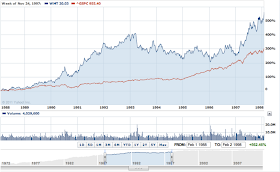
While I wanted to run a stock chart comparison to these early 19th century industrialists, individual stock data from the early 20th century isn't easy to come by.  Still, there are at least three iconic CEOs of the latter 20th century who can arguably be compared to Jobs: Disney, Walton and Gates.  Here's a look at how each company's stock performed in the decade following its CEO's departure.

Each chart begins on the date that the CEO stepped down.

DIS

Click to Enlarge

WMT


MSFT


What's striking is that in the case of DIS and WMT, each stock continued to massively outperform the S&P 500 for 6 and 5 years respectively after the departure Disney and Walton.  Perhaps this is a testament to the bench of talent that a great CEO cultivates.  However, after the 5-6 year mark, both stocks had prolonged periods of underperformance (for DIS at least partially due to the 1974 bear market).  This may be an indication that a visionary CEO can continue to carry a company for years after leaving, but after a while, the company loses the benefit of that vision.

Of the three companies, only MSFT has underperformed the S&P 500 from the day that Gates stepped down.  Of course at least part of this has been because of the collapse of the tech bubble (MSFT was trading at about 60x earnings at the time).  Still, looking at the underlying earnings of MSFT and the gross mismanagement since Gates left, it is a testament to Gates' leadership that the company continues to enjoy top market share in the PC business.  

Another primary reason for MSFT's poor performance has been because of the efforts of Jobs himself who arguably engineered an organic monopoly in high end consumer electronics.   He will be missed for his vision, but we may not really know how much we miss him for another 5 years.

Wednesday, August 24, 2011

Steve Jobs Resigns as CEO of Apple

A sad, sad day.  Truly one of the great capitalists of all time.


Cumulative Net Charge-Off Data

A few days ago I wrote an article on gold and the monetary base posted at Seekingalpha.  One of the comments received there was a request to relate the expansion of the monetary base to banking losses sustained as a result of the credit crisis.

I don't have that exact data, but I remembered that yesterday I did post an overview of banking sector data from the FDIC.  As part of that entry, I included this chart on quarterly charge-offs and provisioning:

Click to Enlarge
I thought it might be interesting to sum the charge-off data to see exactly how much in losses were sustained on bank loan portfolios as a result of the crisis.  It turns out that the aggregate charge-offs to bank loan portfolios have been $557B since 1Q08.  


In 1Q08 there were $7.96 trillion worth of loans on bank balance sheets, which means that total net charge offs have been approximately 7% of outstanding loans since that date (not adjusted for new originations).  Of course the total economic losses are greater than $556B because these losses only account for non-securitized loans (and don't include Fannie and Freddie).

Losses from securities no doubt eclipse losses from the loan portfolios; however, it's more difficult to determine what securities losses were incurred because cash flows were interrupted and which were paper losses.  The nice thing about the net charge-off data is that it is restricted to assets which went bad because the borrower was delinquent.

New Home Months Supply

New home sales data came out yesterday and was pretty weak, but one sign that the market may be healing is the months supply metric, which was reported at 6.6.  We've been at this level of months supply before in the recent cycle, but at a higher level of buying activity.  The combination of depressed buying activity and depressed months supply means that the new home market may finally be clearing.


Tuesday, August 23, 2011

A Demographic Forecast of PE Multiples

The San Francisco Fed puts out some interesting research from time to time.  A recent article discusses the effect that baby boomer retirement could have on equity multiples.

In order to look at the effect demographics have on equity multiples, the writers examined the ratio of middle aged population (40-49) to old age population (60-69) in the US.  They dub this the "M/O Ratio."  The thesis is that at middle age the average investor will have a greater risk tolerance and therefore a larger proportion of savings in equities, which should boost equity valuations.  As a person ages and reduces risk tolerance, he or she will tend to shift to fixed income investments, depressing equity multiples and interest rates.  Thus higher (lower) M/O ratios should lead to higher (lower) equity multiples over time.

The analysis isn't particularly complicated, but the results are striking.  The M/O ratio turns out to be a pretty good forecasting tool for long term P/E multiples.

If the authors extend a projection for the M/O ratio through 2030, the forecast for equity markets isn't particularly encouraging.  According to the model, the P/E ratio should bottom at around 8.5 in 2025.  That's a long bear market...


FDIC 2Q11 Review Depicts a Healthier Banking System

The FDIC released its quarterly review of trends in the banking system for the 2nd quarter.  Below are some takeaways from the data.  Overall, the data paints a picture of a banking system which is healing, though slowly from a bad recession.  I present the data in five sections: Credit Quality, Capital, Profitability, Growth and Trends.

Credit Quality


Over the past several quarters, credit has been healing at banks.  Specifically, noncurrent loans have been falling, albeit slowly from peaks.
Click to Enlarge (all charts)

Using the 80s as a barometer, it could be a significant amount of time until bank balance sheets are fully healed.  Elevated noncurrent assets remained on bank balance sheets for 10 years between 1984-1994.  Also there were a number of false starts where credit looked to be healing and noncurrent loans went on to increase.  Hopefully we're not entering a similar environment.

Not surprisingly, in this cycle the the most persistent noncurrent asset class is residential real estate.  


Residential loans have increased as a percentage of noncurrent loans, even as the dollar value of residential noncurrent loans has fallen.  This indicates that noncurrent residential loans are being resolved at a much slower pace than other types of loans.


Still, overall charge-offs and provisioning continues to move in the right direction.  In anticipation of slowing credit deterioration, charge-offs have exceeded provisioning for the last 6 quarters.

Capital/Liquidity

From the perspective of capital, the banking system continues to show improvement as well.  Capital ratios are above pre-crisis levels both on a leverage and risk weighted basis.


From a historical perspective, capital at US banks has been increasing for many years and is at high levels today.  The leverage ratio is one of the more strict measures of bank capitalization.  The current level, above 8% for our largest banking institutions, indicates an increased ability to weather a double dip.


Aside from pure leverage, the banking system has significantly reduced the "riskiness" of its aggregate portfolio down to 1993 levels.  While the adequacy of risk weightings are debatable, in general balance sheets are likely more resilient to a weak economy.


Relative to current credit conditions, bank capitalization looks similarly strong.  Notice that despite much higher levels of noncurrent loans today, banks were much more poorly capitalized in the 1980s relative to capital and reserves.  For reference, the measure presented below would be closer to 100% for an individual bank on the brink of failure.


Profitability

One of the more prominent areas of concern for equity investors has been the long term profitability of banks due to 1) a low interest rate environment and 2) more strict capital requirements.  While these problems could manifest in future economic cycles, for now banks appear to be repairing profitability reasonably well.  Return on assets was 0.85% annualized for 2Q11.  This is pretty healthy considering that banks continue to have elevated costs related to credit.


Looking at the affect of the low interest rate environment, NIM across the banking sector has trended somewhat lower over the past decade; however, US banks' NIM is still robust compared to many other international banks.


Isolating for the effect of leverage, profitability looks a little more constrained on an ROE basis.  In 2Q11, industry ROE was 7.5%--well below prior peaks.


Growth

Another area of concern for banking stocks has been loan growth, which appeared for the first time in 11 quarters in the 2Q11 (1Q10 loan growth resulted from a reclassification of off-balance sheet loans to on balance sheet).


In a positive sign for the economy, a major driver of the loan growth came from commercial customers.  


In addition to new net borrowing, commercial customers increased utilization of credit lines, which had been relatively low on a historical basis.


Looking at the other side of the balance sheet, deposit growth continues to be extremely strong for banks.  Today, banks' loan to deposit ratio sits at multi-decade lows.  A large deposit cushion gives banks more flexibility in terms of liquidity in the event of a banking panic similar to 2008.

Longer-term trends

From a longer-term perspective, there are some interesting trends which have materialized in the banking sector over the last couple decades, some in relation to the credit crisis and some which may be altered because of it.

One area significantly affected by the housing bubble has been the availability of construction loans.  As the chart below demonstrates, there are a couple-thousand fewer institutions putting significant amounts of capital up for construction loans than there were in 2007.  Construction loans had the highest loss severity and delinquency in the crisis of any type of loan.  As a result, it may be a long time before these come back.

Another longer term trend has been increasing consolidation in the banking system.  Most other nations do not have the same fragmentation that the US banking system does.  Since 1995, the number of banking institutions has fallen significantly, but it still remains highly fragmented.

Even more significant than pure numbers has been the share of assets that banks with more than $10B in assets have taken.  The chart below is a compelling visual representation of large banks' increasing market share from 30% in 1984 to nearly 80% today.  (Some of this is due to the effect that a growing asset base has on bucketing, but it is a compelling chart nonetheless.)


As a result of Basel III and Dodd Frank, the competitiveness of these larger banks has been called into question.  For investors with a longer term outlook, a fundamental question should be whether new regulation will reverse this trend of consolidation.  If it doesn't, then a rehabilitated banking system and depressed prices could be the right ingredients for an M&A wave.

Survey Data on Shifting Household Spending Habits

I thought this was an interesting survey highlighted in Heinz's investor call today.  To me, 43% of households buying less food encapsulates the idea of an evaporating middle class.

Source: Heinz Q1FY12 Conference Call


Monday, August 22, 2011

Gold Price Monetary Base Ratio

I'll be the first to admit that there are some shortcomings to this analysis.  But, to the extent that one believes expansion of the monetary base is the classical definition of inflation and at least a leading indicator of broader price increases, the following ratio may be of some interest.

The price movement in gold has been parabolic recently, but so has the increase in the monetary base.  The ratio of the price of an ounce of gold to the size of the monetary base has remained surprisingly flat since 2008.

Click to Enlarge

Saturday, August 20, 2011

Looking for Reasons to be Bullish

It's never easy to be bullish in an environment like this one, but in attempt to not get too bearish, it's always important to be on the lookout for bullish signals.

One such signal is a comparison of the forward earnings yield of the S&P 500 to the 10 year treasury yield.  The two have diverged significantly in the last couple weeks.  In fact, the forward earnings yield of the S&P 500 based on current year earnings estimates is almost back to where it was in '09.  The spread between the two measures is higher than it was in '09.


Many will quite logically argue that the forward earnings yield is irrelevant because earnings estimates will be revised downward.  While this may be true, the historical spread between the earnings yield of the S&P 500 and the 10 year treasury is in the 2-3% range.  Today, this implies that an earnings yield of 4-5% on the S&P is fair value.  In other words, at this level, earnings on the S&P 500 could be revised down by about 50% to $50 and equities would still not be expensive relative to bonds on a historical basis.

Another indicator acting favorably compared to equities are credit spreads, which don't appear to be quite as concerned about companies' earnings power as equities are.  While equity yields trade back to 2009 levels, credit is still significantly better off than it was in '09.


German Control of Europe in History

Conspiracy theorists love to talk about how the Eurozone  is just a shadow mechanism for Germany to assert its imperialistic goals to control Europe.  I'm not personally a buyer of the theory, but watching Eurozone negotiations unfold, it's clear that most are looking to Germany for leadership.

For some off-beat analysis, a comparison of different periods of European consolidation.  Just eyeballing the maps, it looks like the 3rd Reich was able to consolidate a bit more than the 4th.  Still, considering Hitler was using tanks and Merkel is only armed with the power of persuasion, it's pretty impressive how much of Europe modern Germany "controls."

Eurozone member states


German Occupation in WW2


For reference, here's what Napoleon accomplished:


Of course, the most impressive empire has to be the Roman, if for no other reason than that no one came close to consolidating Europe to the extent they did for another 1500 years.

Thursday, August 18, 2011

UPDATE: Philly Fed Chart with Recession Bars

I updated the chart of the Philly Fed readings to include recession bars (shaded in gray).  The bars confirm that the survey doesn't go this low without us already being in a recession or about to go into one within the next couple months.  Let's hope for a revision.

Click to Enlarge

Bank ETF almost back to Recession Territory

The KBE, which is the large cap bank ETF is at $18.37 today, which is extremely close to where it traded at the beginning of July '09.  In July '09 banks led a big rally in the markets fueled by whispers that the recession was finally over.  Looking back, NBER would opine months later that July of '09 was indeed the end of the recession.

As the chatter that we're back in a recession grows louder, it's fitting that banks as a group are back to where they started.

Click to Enlarge

Philly Fed -30 Extremely Ugly

The Philly Fed survey economic activity index printed a -30 for August.  I don't want to say this seals the deal that we're in a recession, but I don't think the Philly Fed survey gets this low without one.  As shown in the table below, -30 means that 45% of respondents replied that business has slowed in the month.

Click to Enlarge