

Showing posts with label Economic Cycle. Show all posts
Showing posts with label Economic Cycle. Show all posts
Tuesday, January 8, 2013
Seven Years Since Housing Starts Peaked
Carrying over some of the thoughts from the January investment letter about the economic cycle starting to get up in age, it's hard to believe that it's now been seven full years since the housing market started to show signs of peaking. For comparison it was six years between the peak of the NASDAQ and the housing peak. Some other seven-ish year cycles: intra-depression 1930-1937, and the 1970s economic cycle went peak to peak 1973-1980.


Wednesday, November 7, 2012
Are we Heading For a Recession?
Every time the equity markets go through a correction the recession chatter seems to pick up. In the last few days, the chart below has started to pop up around the internet in support of the idea that we might be heading for one again. It's a recession probability index (which isn't widely followed to my knowledge) but has a good track record of predicting previous recessions and is past the threshold that has signaled false alarms before.

The indicator was developed by two professors, Marcelle Chauvet and Jeremy Piger. The inputs are: "a dynamic-factor markov-switching model applied to four monthly coincident variables: non-farm payroll employment, the index of industrial production, real personal income excluding transfer payments, and real manufacturing and trade sales."


I'm not particularly familiar with this indicator so it's tough to know what the biases could be, but I generally tend to be somewhat skeptical of models like this one.
A more time tested recession indicator is the slope of the yield curve--when the spread between 2 year and 10 year treasuries is inverted recession normally follows. In a zero interest rate environment the yield curve may have lost some of its informational content, but it's been a great cyclical indicator for a long time and it's grounded in sound economic logic, so it shouldn't be totally ignored. Today, even though the curve has flattened since '09 it is still not at or near the zero threshold. As of right now I'm still on the lookout for the yield curve to go completely flat or invert when recession is imminent, even in this environment.
A more time tested recession indicator is the slope of the yield curve--when the spread between 2 year and 10 year treasuries is inverted recession normally follows. In a zero interest rate environment the yield curve may have lost some of its informational content, but it's been a great cyclical indicator for a long time and it's grounded in sound economic logic, so it shouldn't be totally ignored. Today, even though the curve has flattened since '09 it is still not at or near the zero threshold. As of right now I'm still on the lookout for the yield curve to go completely flat or invert when recession is imminent, even in this environment.
To clarify, I did write yesterday in my investor letter that I think recession will happen sometime in the next presidential term, but that doesn't necessarily mean it's imminent. My base case is that it could start sometime late next year absent a totally botched fiscal cliff. The forecast is mostly reliant on the average duration of economic expansions. As I've written before, this expansion would be short even compared to the 1933 expansion if it ended today.

Wednesday, October 3, 2012
Duration of Economic Expansions
From time to time one may still hear analogies linking our current economic period to the Great Depression. Most know that the Depression consisted of two separate recessions, one which started in 1929 and the other in 1937. The intervening period was technically an expansion but wasn't much to write home about.
Our current economy is also often compared to the 1970s because the stock market went sideways for about a decade during that time as well before ultimately culminating in the early 80s inflationary recession.

If each of those periods are comparable and we sit in an economic purgatory between one recession and another, it might be at least mildly comforting to think that the next recession could still be a year away. The economic expansion between 1933-1937 lasted 50 months and the expansion from 1975-1980 lasted 58. Our current expansion is still only 39 months old. Just a babe! A full list of economic expansions can be found here.

Thursday, September 27, 2012
Long Term Durable Goods Orders Chart
Durable goods orders posted a terrible print this morning for August. The Series showed a 13% m/m decline. Much of this came from the transports component, which is notoriously volatile. Still, the magnitude of the drop is certainly noteworthy.
The 13% decline is the 3rd largest drop in the history of the series which goes back to 1992. There hasn't ever been this large of a decline outside of a recession.
Before we declare the end of this expansion though, it is most likely that this is an anomaly rather than an indication of the state of the economy. To some extent this datapoint was already reflected in the sub-50 ISM reading that was reported at the beginning of September. For a more salient indicator, all eyes should be on how ISM measures this coming monday.
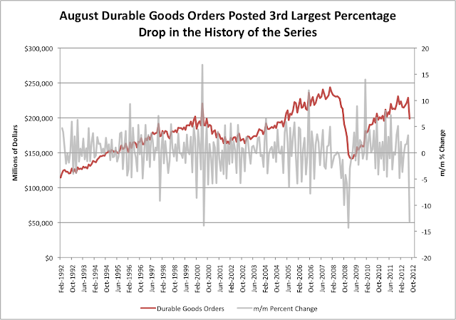
The 13% decline is the 3rd largest drop in the history of the series which goes back to 1992. There hasn't ever been this large of a decline outside of a recession.
Before we declare the end of this expansion though, it is most likely that this is an anomaly rather than an indication of the state of the economy. To some extent this datapoint was already reflected in the sub-50 ISM reading that was reported at the beginning of September. For a more salient indicator, all eyes should be on how ISM measures this coming monday.

Friday, September 7, 2012
2006 vs. 2012 Again
I've posted this chart a few times this year already, and figured it might be a good time for an update. The reasoning behind the comparison is that 2009-2011 traded almost in lockstep with 2003-2005. So far the pattern in 2012 has been similar to 2006, but the pace of the advance has been a little steeper. If the comparison holds come year end, the S&P would have to trade sideways or lower between here and then.


Tuesday, September 4, 2012
ISM as Recession Indicator
ISM was reported at sub 50 for the 3rd month in a row. Does that mean that a recession is imminent?

Below is a chart of ISM stripped down to only include times that the indicator has been below 50 for at least 3 months in a row. There have been roughly 17 periods in which ISM has had a 3 month sub-50 streak. Of those 17 times, 6 have been outside of a recession: 1951, 1967, 1985, 1995, 1998 and 2003.

Wednesday, August 15, 2012
Capacity Utilization Almost Back to Pre-Recession Levels
Capacity utilization was reported this morning at 79.3% which is a new high for this economic cycle and puts the indicator pretty close to its former cycle highs. In 2007 capacity utilization peaked at 80.8%.
Increasing capacity utilization is generally a good sign for economic activity but can have important implications for the economy based on how businesses choose to react to the tightening capacity. If businesses choose to invest in new infrastructure, this can provide a late cycle boom to the economy. On the other hand if there is demand growth without capacity expansion, one would expect more inflationary pressure.

Increasing capacity utilization is generally a good sign for economic activity but can have important implications for the economy based on how businesses choose to react to the tightening capacity. If businesses choose to invest in new infrastructure, this can provide a late cycle boom to the economy. On the other hand if there is demand growth without capacity expansion, one would expect more inflationary pressure.

Wednesday, July 18, 2012
How Does Housing Compare to the Tech Cycle?
Even though Bank of America is trading lower, today's quarterly release capped off what was a surprisingly good quarter for major US Banks. In general, loans and deposits both showed growth, capital levels are extremely high and credit quality is significantly improved from where it was during the crisis. Similarly, the housing sector has had some healthy reports as well recently (see previous post).
Seeing as how housing and banking were at the epicenter of the previous crisis, what does the fact that the two sectors are recovering say about where we are in the current economic cycle? To try to help discern how this cycle compares to previous cycles, below is a chart comparing the performance of housing (ITB) and Financials (XLF) in this cycle to Technology (XLK) in the last one. The chart shows relative performance of ITB, XLF and XLK compared to the S&P 500. ITB and XLF are shown from 2006 and 2012 and XLK is shown between 2000 and 2007.
After the sharp collapse of technology stocks relative to the S&P from 2000-2002, XLK languished on a relative basis for the next four years before finally starting to outperform in 2006. Similarly, both XLF and ITB showed steep drops and have continued to be losers since. Now, years later, they may finally be starting to show signs of a turn. XLK continued to steadily outperform the S&P 500 through 2012. However, by the time XLK turned in 2006, the general economy only had one year left before it began to contract.

Seeing as how housing and banking were at the epicenter of the previous crisis, what does the fact that the two sectors are recovering say about where we are in the current economic cycle? To try to help discern how this cycle compares to previous cycles, below is a chart comparing the performance of housing (ITB) and Financials (XLF) in this cycle to Technology (XLK) in the last one. The chart shows relative performance of ITB, XLF and XLK compared to the S&P 500. ITB and XLF are shown from 2006 and 2012 and XLK is shown between 2000 and 2007.
After the sharp collapse of technology stocks relative to the S&P from 2000-2002, XLK languished on a relative basis for the next four years before finally starting to outperform in 2006. Similarly, both XLF and ITB showed steep drops and have continued to be losers since. Now, years later, they may finally be starting to show signs of a turn. XLK continued to steadily outperform the S&P 500 through 2012. However, by the time XLK turned in 2006, the general economy only had one year left before it began to contract.

Subscribe to:
Posts (Atom)