

Showing posts with label SPX. Show all posts
Showing posts with label SPX. Show all posts
Wednesday, February 6, 2013
CPI Adjusted S&P 500
As the S&P 500 continues to approach its former all time high, below is a long term chart of the index adjusted for CPI. While we're not too far from the 2007 highs on a nominal basis, the index is still about 11% lower than it was in 2007 on a CPI adjusted basis and 25% lower than the all time high reached in 2000. The armchair technician in me has drawn a line to point out that we're approaching inflation adjusted resistance.


Tuesday, January 29, 2013
QE Effect on S&P 500
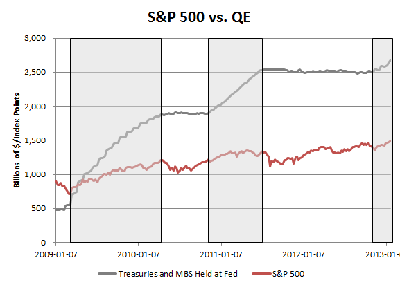
After QE3's announcement in mid September there was some concern that the effect of QE on the market had eroded because the S&P 500 proceeded to sell off by 5%. It could be true that QE is losing its efficacy, but it's worth noting that true balance sheet expansion didn't really start until mid November because of the mechanics of MBS purchases. It therefore may or may not be coincidental that MBS started to show up on the Fed's balance sheet around the same time that the S&P 500 found a bottom.
Below is a chart of how the S&P 500 has done during periods of QE, but instead of using the announcement dates, the chart highlights the times that the Fed's holdings of Treasuries and MBS were increasing (note that this analysis therefore excludes operation twist). Since the S&P 500 is now hitting new cycle highs, perhaps one could argue that QE hasn't exactly lost its potency.
How Long Does the Average Bull Market Rally Last?
As of today, the bull market which began in March of 2009 is 1,422 calendar days old. Over that whole period there have been nine drawdowns of greater than 5% which segment the bull market into ten periods of bull market rally.
The average bull market rally since 2009 has lasted 99 calendar days and has seen the market rise by 18.8%. By contrast our current rally, which started in mid November, is just 75 days old and has charted a 10.9% rise. If this rally were to last in line with the averages it would go on until February 22 and the S&P 500 would rise to 1608 before the next 5% pullback. Below is a chart of the full bull market broken down by periods of rally and >5% drawdown.

The average bull market rally since 2009 has lasted 99 calendar days and has seen the market rise by 18.8%. By contrast our current rally, which started in mid November, is just 75 days old and has charted a 10.9% rise. If this rally were to last in line with the averages it would go on until February 22 and the S&P 500 would rise to 1608 before the next 5% pullback. Below is a chart of the full bull market broken down by periods of rally and >5% drawdown.

Monday, January 28, 2013
SPY vs. TLT
2013 is beginning the year with a strong dichotomy in asset class returns. While the S&P 500 is on pace to have its best January since 1997, the 10 year yield has moved higher by 20 bps. Expressed in more intuitive terms, SPY is up 5.3% year to date, while TLT is down 3%. The divergence between the two could represent some psychological pain for any investors substantially invested in bonds.


Wednesday, January 23, 2013
S&P 500 Unchanged Since 2000?
The S&P 500 is just 10 points away from reclaiming the 1500 mark, a level it first hit nearly 13 years ago in March of 2000. The overall index may be flat since then, but that's not to say that there hasn't been plenty of change beneath the surface.
Nearly half of the companies in the index have changed since 2000--only 269 of the same companies remain. The market cap of four of those companies have appreciated by more than 1000%, while the same number have lost more than 80% of their value.
The vast majority of market caps have moved significantly more or less than the index. In fact, there are only eight companies that are +/-3% from where they were in 2000 and 22 are +/-10%. Below is a list of companies that have remained in the S&P 500 since 2000 with the smallest change in market cap.

NOTE: original post compared share prices, but the database I was pulling from had some trouble dealing with splits so there were some problems with the analysis.
Nearly half of the companies in the index have changed since 2000--only 269 of the same companies remain. The market cap of four of those companies have appreciated by more than 1000%, while the same number have lost more than 80% of their value.
The vast majority of market caps have moved significantly more or less than the index. In fact, there are only eight companies that are +/-3% from where they were in 2000 and 22 are +/-10%. Below is a list of companies that have remained in the S&P 500 since 2000 with the smallest change in market cap.

NOTE: original post compared share prices, but the database I was pulling from had some trouble dealing with splits so there were some problems with the analysis.
Friday, January 18, 2013
Mayan Apocalypse (Cross) Averted
Circling back on a slightly ridiculous market indicator that we had been tracking here: not only was the Mayan Apocalypse averted back in December, but so was the Mayan Apocalypse Cross (which we dubbed a cross over of the 50/200 month moving average). Thanks to the rally that we've had since November the apocalypse cross never happened. The 50 month moving average has only crossed below the 200 month twice in the last 100 years, once at the end of the 70s bear market and once in the middle of the depression.

Speaking of moving averages, the 50 and 200 day moving averages have recently crossed for 10 year interest rates.


Speaking of moving averages, the 50 and 200 day moving averages have recently crossed for 10 year interest rates.

Thursday, January 17, 2013
Years That the S&P 500 Never Went Negative
Scanning data of the S&P 500 since 1957 produced only three other years that the index started the year positive and never closed negative on a YTD basis. Below are the charts of those years: 1958, 1964, 1976 and 2012. The returns in these years were 43%, 16%, 23% and 16% respectively. An initial run of the data produced 12 years that were almost perfect, but 8 of those were lower on the first day of trading before heading higher for the rest of the year.


Tuesday, December 11, 2012
Is Tax Selling Causing Apple's Decline?
In recent weeks, there has been talk that part of Apple's 23% decline may be due to the fact that capital gains taxes are likely to go up in 2013. The logic goes that since many Apple shareholders are sitting on large capital gains, they are selling to lock in a lower tax rate. If that logic were true one would expect to see similar selling in other top performing stocks, but on average other top long term holds have not seen the same decline that Apple has.
In October I posted a list of the top performing stocks since October 2007--stocks which should have large embedded capital gains liabilities. The chart below compares their performance since the election. It turns out that on average these stocks have continued to do better than the S&P 500 since November 6. This basket has outperformed the S&P by 2.8% since then.

In October I posted a list of the top performing stocks since October 2007--stocks which should have large embedded capital gains liabilities. The chart below compares their performance since the election. It turns out that on average these stocks have continued to do better than the S&P 500 since November 6. This basket has outperformed the S&P by 2.8% since then.

Tuesday, November 27, 2012
Is [The] Santa Claus [Rally] Real?
The end of this week will bring the end of November, and with that there is the usual seasonal talk about a Santa Claus rally in the stock market. The logic goes that stocks usually rally between Thanksgiving and Christmas, but much like with Kris Kringle himself, it's fair to ask the question: does the Santa Claus rally really exist?
Looking at the historical data, since 1957 December has been a positive month on average for equities. In the past 5 years it has been especially good--powered by a nearly 11% gain in 2008 and 4% gain in 2010. Below is the average path that the S&P 500 takes during December. It demonstrates some Christmas magic may indeed exist--the path is even strangely sleigh like...

Looking at the historical data, since 1957 December has been a positive month on average for equities. In the past 5 years it has been especially good--powered by a nearly 11% gain in 2008 and 4% gain in 2010. Below is the average path that the S&P 500 takes during December. It demonstrates some Christmas magic may indeed exist--the path is even strangely sleigh like...

Monday, November 26, 2012
S&P 500 Down Just 0.21% In November
Even though we're set to open slightly lower this morning, the S&P 500 is hardly down at all for November. This is amazing considering that it was down as much as 5% mid month. The pattern is similar to 2011, when the S&P 500 was down by 7.5% mid month, but ended it down only 0.5%


Wednesday, November 14, 2012
S&P 500 Historical Annual Performance vs. Dow
After today's selloff, the S&P 500 is up 7.8% for the year (ex-dividends) while the Dow is only up 2.9%. This means that the S&P 500 is outperforming the Dow by 490 bps, which seems like a lot given that the indexes are both large cap indices.
Still if the indexes ended the year with this performance, it wouldn't be the largest historical spread between the two. In 55 years of S&P 500 history, there have been 10 years that it has beaten the Dow by more than 5% (ex-dividends). There are also 9 years that the Dow has beaten the S&P 500 by the same spread.

Makes you think--what's the point of benchmarking active managers if even similar benchmarks outperform one another from year to year?
Still if the indexes ended the year with this performance, it wouldn't be the largest historical spread between the two. In 55 years of S&P 500 history, there have been 10 years that it has beaten the Dow by more than 5% (ex-dividends). There are also 9 years that the Dow has beaten the S&P 500 by the same spread.

Makes you think--what's the point of benchmarking active managers if even similar benchmarks outperform one another from year to year?
Tuesday, November 13, 2012
5% Pullbacks Since the Start of The Bull Market
With the S&P 500 at 1384, we're currently more than 5% off of the most recent high for the S&P 500. This marks the 9th time since the market bottomed in March of 2009 that the S&P has had a draw-down of at least 5%.
Below is a list of all the times that the market has experienced at least a 5% pullback over the last ~4 years along with the duration of the pullback in terms of number of trading days to the bottom and number of trading days to the next peak.
The most recent pullback hit its lowest (closing) point 38 trading days into the draw-down, which is slightly longer than the average during this bull market (although the data is not exactly normally distributed).
Below is a list of all the times that the market has experienced at least a 5% pullback over the last ~4 years along with the duration of the pullback in terms of number of trading days to the bottom and number of trading days to the next peak.
The most recent pullback hit its lowest (closing) point 38 trading days into the draw-down, which is slightly longer than the average during this bull market (although the data is not exactly normally distributed).
 |
| Note: expressed in trading days |
Monday, November 12, 2012
Have Top Performers Led the Recent Market Decline?
The S&P 500 is down a little over 5% since September 14th, and it feels like the decline has been led by some of the best performing stocks of the last few years. Apple is down 21.5% over that period, Chipotle down 25% and Monster Energy down 15%; these are just some examples of high fliers that have been hit hard over the last two months.
While it feels like there are a lot of high profile companies that have declined recently, in actuality the best performers since since 2009 have done slightly better than the market since September, while the worst performing stocks since '09 have continued to do poorly.

While it feels like there are a lot of high profile companies that have declined recently, in actuality the best performers since since 2009 have done slightly better than the market since September, while the worst performing stocks since '09 have continued to do poorly.

Thursday, November 8, 2012
Checking Back in on 2006 vs. 2012
Early this year (back on January 4th) I posted that 2009, 2010 and 2011 had followed the pace of the 2003, 2004, 2005 rally almost perfectly. Since then we've been checking back in periodically to see how well 2012 has paced 2006. The pattern has actually been eerily similar except for the fact that the pace of the rally that came off of the summer lows was slightly faster than in 2006 and reached a higher high. The recent 5% pullback has corrected for that though, and now 2012 looks almost exactly like 2006 again.


Wednesday, November 7, 2012
S&P 500 After Obama 2008 Election
Even though November 2008 was a much different market environment than November 2012, it's worth noting that equity markets sold off pretty hard after Obama was elected in 2008 too. The volatility surrounding the financial crisis was extreme, but leading up to the election the S&P 500 had found some footing rallying from 850 to 1000.
Following the election the S&P lost 25% in 13 trading days. On November 21 the S&P 500 made a near term bottom that would last until February 2009. There was a big intra-day reversal when it was leaked that Tim Geithner would be Treasury secretary. Four years later, as we wait to find out who his replacement will be, maybe that person could spark a rally of her/his own.

Monday, October 15, 2012
Abstract Painting (809-4) Gives Clapton 21% Annualized Return
There was an article in the Journal today about a painting by Gerhard Richter entitled Abstract Painting (809-4) which sold for $34m, the highest price ever for a living artist's work. The article mentions that the painting was purchased by Eric Clapton for $3.1m in 2001, which is a 21.2% annualized return. For comparison, AAPL has given a ~41% annualized return and Gold has returned ~16% per year since then. The S&P has returned about 1.5% before dividends in the same time.


Thursday, October 11, 2012
How Often Does the S&P 500 Trade Below its 50 DMA?
Given the choppy trading environment that we've been going through recently, the S&P 500 is getting closer to trading at its 50 day moving average. Since the market has generally been up this year, it hasn't spent much time below that mark. In fact, out of 195 trading days in 2012, the S&P has only spent 45 days or 23% of the time below its 50 day moving average. How does that compare to history? In 65 years of history, the S&P trades below its 50 DMA about 37% of the time. In 1995 there was only 1 day that it was below the average and in 2008 it spent 195 days below it.


Tuesday, October 9, 2012
Best Performing Stocks Since 2007 Peak
In order to celebrate the five year anniversary of the highest point in the S&P 500 set at 1561, I put together a list of the best performing stocks since that day. While it's probably not surprising that AAPL is at the top, there are certainly some surprises on the list. Dillard's, at #2, flies almost completely under the radar but has more than tripled over the last 5 years.


Wednesday, October 3, 2012
Earnings Estimate Accuracy
Earnings season is set to pick up again starting next week, and it's an important season because earnings growth has begun to slow in recent quarters even as the market has risen. Analysts are expecting S&P 500 earnings to rise to $103 this year from $97 last year.
Below is a chart of analyst expectations for S&P 500 earnings vs. realized earnings. (The gray line shows the evolution of what analysts are forecasting for year end earnings throughout the year.) No surprise, analysts' mid year forecasts rarely end up being correct, but eyeballing the data, when earnings estimates are below their highest annual levels this late in the year, realized earnings typically end up disappointing early year estimates.

Monday, October 1, 2012
Historical Relationship of S&P 500 Earnings to GDP
The S&P 500 is up nearly 16% year to date, even though earnings are expected to grow 4-5% for the year. If earnings grow by that much, the growth rate would be roughly in line with nominal GDP growth, which was up 3.9% y/y in the most recent quarter (real annualized GDP growth was only 1.3%).
Below is a long term chart of S&P 500 earnings compared to GDP. Even though earnings are slightly more volatile than GDP, over the long term the growth of each has been about the same. Recently S&P 500 earnings have grown faster than nominal GDP as the economy has had a V shaped recovery. One might expect this circumstance to reverse, or at least temper itself going forward.

Below is a long term chart of S&P 500 earnings compared to GDP. Even though earnings are slightly more volatile than GDP, over the long term the growth of each has been about the same. Recently S&P 500 earnings have grown faster than nominal GDP as the economy has had a V shaped recovery. One might expect this circumstance to reverse, or at least temper itself going forward.

Subscribe to:
Posts (Atom)