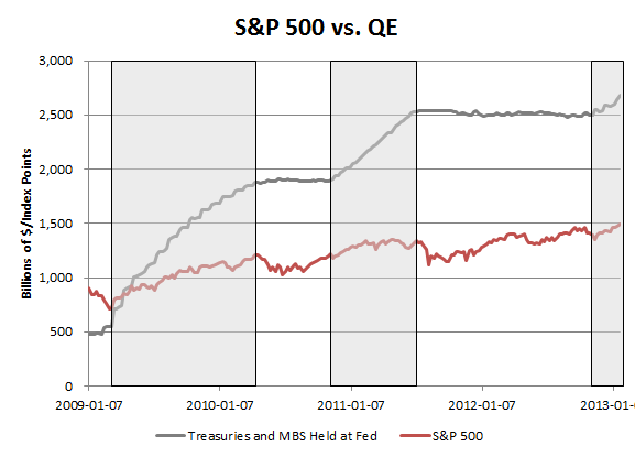
Below is a chart of how the S&P 500 has done during periods of QE, but instead of using the announcement dates, the chart highlights the times that the Fed's holdings of Treasuries and MBS were increasing (note that this analysis therefore excludes operation twist). Since the S&P 500 is now hitting new cycle highs, perhaps one could argue that QE hasn't exactly lost its potency.
Showing posts with label QE. Show all posts
Tuesday, January 29, 2013
QE Effect on S&P 500
After QE3's announcement in mid September there was some concern that the effect of QE on the market had eroded because the S&P 500 proceeded to sell off by 5%. It could be true that QE is losing its efficacy, but it's worth noting that true balance sheet expansion didn't really start until mid November because of the mechanics of MBS purchases. It therefore may or may not be coincidental that MBS started to show up on the Fed's balance sheet around the same time that the S&P 500 found a bottom.
Thursday, January 24, 2013
Putting Apple's Decline in Perspective
Apple's 10% decline today represents a $45B loss of market value, which is a larger amount than the market cap of 85% of the companies that make up the S&P 500. $45B is roughly equivalent to the market value of COST, NKE or MDT.
Since its peak at $659B in September AAPL has lost $230B worth of value. That's more than the market cap of all but seven US companies, nearly equal to the entire value of MSFT, CVX and GE!
In fact, AAPL's loss in market value has been so large so fast that it is entering the realm of macroeconomic proportions. Since September, AAPL's market cap decline has been almost equal to the amount of money that the Fed has injected into the economy via QE3, which sits at ~$250B.
Since its peak at $659B in September AAPL has lost $230B worth of value. That's more than the market cap of all but seven US companies, nearly equal to the entire value of MSFT, CVX and GE!
In fact, AAPL's loss in market value has been so large so fast that it is entering the realm of macroeconomic proportions. Since September, AAPL's market cap decline has been almost equal to the amount of money that the Fed has injected into the economy via QE3, which sits at ~$250B.
![]() |
| QE3 measured as increase in MBS/Treasuries at Fed plus commitments to buy MBS |
Thursday, December 13, 2012
Annual Change in Monetary Base Since 1918
After yesterday's post forecasting that we could see a 40% y/y increase in the monetary base in 2013, I thought it might be good to look at a long term chart of the monetary base to put that number into context. Below is a chart showing the rolling y/y increase in the monetary base since 1918. The only other time there has been such a steep increase in the US base was during the depression/WWII era during which there were three different periods of 20% annual growth in the base.
Wednesday, December 12, 2012
How Fast Should We Expect Unemployment to Decline?
To go along with the previous post forecasting when a 6.5% unemployment rate could occur, below is some analysis on how fast unemployment typically drops when we are in a period of falling unemployment. Since 1949 there have been 10 periods of falling unemployment. On average the unemployment rate falls by about 7 bps per month when it is declining.
Although the "scariest jobs chart ever" which has made the rounds on the internet implies that unemployment is falling at a much slower pace than it has in past cycles, in reality, we're basically in line with the average rate of decline (the unemployment rate just spiked from a lower base than it had in the past.)
When Will Unemployment Hit 6.5%?
As part of today's statement, the Fed acknowledged that it would be maintaining the current QE rate until unemployment hits 6.5% or inflation gets out of hand (paraphrase). Below is an estimate of when unemployment could hit that level based on an extrapolation of the current pace of decline. Since peaking in late 2009 at 10%, the unemployment rate has fallen on average at about 6 basis points per month (.06%). If it continues at this pace, the unemployment rate would hit 6.5% in mid 2014.
[Note that the decline has not materially picked up much pace in 2012. In 2012 the rate declined by an average of 7bps per month. At this pace 6.5% would occur just a few months earlier in 2014.]
[Note that the decline has not materially picked up much pace in 2012. In 2012 the rate declined by an average of 7bps per month. At this pace 6.5% would occur just a few months earlier in 2014.]
Forecast of Monetary Base Through 2014
Well, it's official. As was widely expected, the Fed announced today that it would increase the size of QE to $85B per month from $40B per month. Below is an updated forecast of what the US monetary base could look like to start 2015 if QE lasts that long (for the record, my money says it wont). At its peak growth rate, the base will increase by ~40% y/y. Under the previously announced program the base was slated to grow by a robust 17%. By 2015 the monetary base could be nearly 6x the size it was in 2008.
Friday, November 30, 2012
QE3 Just Starting to Hit Fed Balance Sheet
Although QE3 was announced almost 2.5 months ago, the mortgages that the Fed has been purchasing have only just started to hit the Fed's balance sheet over the last couple of weeks. The monetary base has continued to hold flat, but mortgage holdings have ticked ever so slightly higher.
The Fed has agreed to purchase ~$100B worth of mortgages since September, but holdings have only increased by $40B due to the lag in time of settlement for MBS trades. The fact that the balance sheet has mostly been unchanged suggests that we may not yet have seen the effects of QE3 in securities markets.
Thursday, October 25, 2012
Monetary Base Still Not Growing
Even though QE3 has now been in effect for over a month, the monetary base hasn't budged since it was announced. As I've documented before, the monetary base has been highly correlated with commodity prices since QE began in 2008, so the fact that the base has not broken out higher could help to explain why crude and gold are also failing to make new highs.
Thursday, October 4, 2012
Monetary Base Since QE3
The monetary base is an indicator which I always pay close attention to because it has been highly correlated with the price of oil and gold since 2009. Since QE3 was announced I have been paying even closer attention to the measure than usual, but it hasn't yet moved as one would expect it to. Over the last several weeks the monetary base has fallen as the Fed has purchased more MBS for reasons that I don't totally understand (likely some technicality and timing of the way assets are accounted for in the Fed's H.4.1 release). I would expect this to reverse in the coming weeks, but until it does, it may help to explain why oil has been weak since QE3 as well.
Thursday, September 13, 2012
What Happened the Last Time the Fed Announced QE?
The S&P 500 is up 1.2% currently following the announcement of new QE. This is not unlike the pattern that we saw in 2010 where the market rallied out of the summer on the expectation that there would be more QE and rose again on the day that QE was announced. However, over the next 8 trading days immediately following the announcement of QE2 the market fell 4.4% as it consolidated. It then continued to rally for about 2.5 more months.
Forecast of Monetary Base to 2015 Based on Today's Fed Action
Pretty much as expected, the Fed announced that it will be conducting outright QE at the pace of $40B per month without any clear end date. Based on this pace of purchases, below is a forecast of what the monetary base could look like out to 2015 assuming that the Fed prints at today's pace for as long as it intends to keep rates exceptionally low.
If this pace were maintained until then, the monetary base would increase by about 5x between 2008-2016, which would be a CAGR of 22%. The current pace of $40B per month represents an annualized growth of about 18% from current levels. Given gold and oil's correlation with the growth of the monetary base, $2700 gold and $170 brent crude prices might not be out of the question if the Fed maintains QE for that long.
Correlation of Rates and S&P 500
Operation twist has had the opposite effect on rates that outright QE has had, but equities have rallied during twist just like they did during QE1/2. This has lead to a divergence between equities and interest rates over the past year. Previously equities and rates had been relatively correlated: when equities moved higher so did interest rates. Recently though, the daily correlation has broken down and over the past year has actually turned slightly negative.
Thursday, July 26, 2012
Monetary Base Grew Last Week
One indicator that we pay close attention to is the monetary base, the sum of currency and reserve balances at the Fed. Over the last two weeks the base has grown by $43B, about 1.5%. The base is important to us because of the relationship that it has had with commodity prices over the last several years. If the relationship holds, it might suggest that commodity prices like oil and gold will trend sideways rather than down.
As far as Fed Balance sheet trends go, it's also worth noting that reserve balances continue to fall. The "reserve balances" line is a perennially misunderstood line-item, which is often used as evidence that excess liquidity is just being stored at the Fed rather than entering the economy. In actually the high level of excess reserves is just a symptom of QE because in the aggregate all of the reserves in the system must return to the Fed even if different banks hold them. At any rate, these reserves are now starting to be converted more rapidly into hard currency, which should render the argument over excess reserves moot.
Fed Liabilities Portion of Balance Sheet:
As far as Fed Balance sheet trends go, it's also worth noting that reserve balances continue to fall. The "reserve balances" line is a perennially misunderstood line-item, which is often used as evidence that excess liquidity is just being stored at the Fed rather than entering the economy. In actually the high level of excess reserves is just a symptom of QE because in the aggregate all of the reserves in the system must return to the Fed even if different banks hold them. At any rate, these reserves are now starting to be converted more rapidly into hard currency, which should render the argument over excess reserves moot.
Subscribe to:
Posts (Atom)