 Subscribe in a reader

Tuesday, February 19, 2013
RSS Subscribers
The old RSS feed for this website is no longer active. Please click the icon below to re-subscribe to the working RSS feed.
Subscribe in a reader
Subscribe in a reader
Friday, February 15, 2013
Moving on Up!
Avondale is moving! We are joining the stocktwits blog network to pair up with some of the best financial bloggers on the internet.
As a result, our blogspot address (avondaleassetmanagement.blogspot.com) will no longer be updated. Please visit us from now on at www.avondaleam.com
Tuesday, February 12, 2013
The Swiss National Bank's Currency Peg
Between the Yen and the Euro, the foreign exchange markets have seen some excitement in recent months. One currency cross that has been anything but exciting though has been that of the Euro against the Swiss Franc (EUR/CHF). After a rapid depreciation of the Euro during the heart of the European Financial Crisis, the Swiss National Bank decided to explicitly peg the Swiss Franc at 1.20 EUR/CHF. The SNB had maintained a "soft peg" up until that point by purchasing EUR in the open market, but the explicit peg was needed to stop the appreciation.
Below is a chart of the evolution of the SNB balance sheet as it has tried to stop the CHF from appreciating. The balance sheet has expanded by nearly 5x and foreign currency now represents almost 90% of the bank's assets. As a result, the CHF has effectively become backed by the Euro.

Below is a chart of the evolution of the SNB balance sheet as it has tried to stop the CHF from appreciating. The balance sheet has expanded by nearly 5x and foreign currency now represents almost 90% of the bank's assets. As a result, the CHF has effectively become backed by the Euro.
Monday, February 11, 2013
Where do Growth Stocks Peak?
Over the course of the recent bull market there have been a few growth stocks that have hit extreme levels only to come crashing down. Although some of these have recovered slightly, those that come to mind include: NFLX, GMCR, OPEN, MNST and CMG.
As a post-mortem on these stocks, below is a chart of the price to sales multiples that they hit at their highest levels. For comparison I included the peak price to sales multiples of five stocks that had similar sentiment (judged subjectively) at the 07 peak and five from the dot com era. Also included are the current multiples of six growth stocks that haven't slowed since 2009.
 |
| Note: red bar is the average multiple for the group |
Total Fiscal and Monetary Stimulus Since 2008
As many are hopeful that we are finally leaving the financial crisis behind, sometime in the not too distant future the government is going to have to start unwinding the major stimulus that it has provided to the economy through fiscal deficits and monetary expansion since the crisis began.
Below is a cumulative tally of how much stimulus has come from the Fed and Treasury over the last four years. The total is now about $7T ($5T worth of deficits plus another $2T worth of monetary expansion). Amazingly, to the extent that one believes that the crisis was primarily housing market related, the $7T total represents ~70% of all the mortgage debt outstanding in 2008.
Below is a cumulative tally of how much stimulus has come from the Fed and Treasury over the last four years. The total is now about $7T ($5T worth of deficits plus another $2T worth of monetary expansion). Amazingly, to the extent that one believes that the crisis was primarily housing market related, the $7T total represents ~70% of all the mortgage debt outstanding in 2008.
 |
| Cumulative deficit plus change in size of Fed balance sheet since 9/2008 |
Friday, February 8, 2013
Finance Website Web Traffic Comparison
Below is a comparison of the web traffic rank of some of the most popular finance sites on the web. The list was formulated simply based on websites that came to mind, so it's highly probable that I missed some high traffic sites in here somewhere. CNN money, yahoo finance and google finance are also three big finance sites that would make the list which can't be extracted from their larger parent sites.
For all the fragmentation of news that the web has caused, the big guys still get the most traffic. Business insider is the lone new-media entrant which has competitive traffic numbers to Forbes, etc. The only true blog that makes this list is zerohedge. The average big name finance blog has a rank between 20,000 and 200,000.
For all the fragmentation of news that the web has caused, the big guys still get the most traffic. Business insider is the lone new-media entrant which has competitive traffic numbers to Forbes, etc. The only true blog that makes this list is zerohedge. The average big name finance blog has a rank between 20,000 and 200,000.
 |
Thursday, February 7, 2013
Monetary Base Breaks Out
Data released by the Fed today confirmed that the Monetary Base has officially risen above the range that it had settled in since July of 2011. Since roughly the same time period brent crude oil and gold have also been stuck in a prolonged sideways move, although in recent weeks crude has also begun to turn higher along with the base.


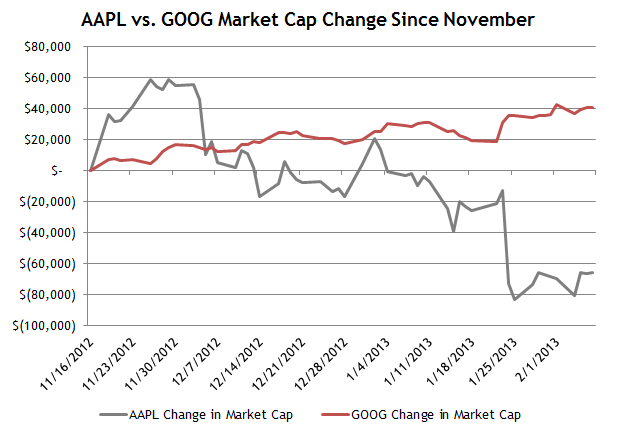
Is AAPL's Loss GOOG's Gain?
Although GOOG refuses to directly monetize its dominant position in mobile, one might expect that any lost market cap for AAPL might be gobbled up by GOOG because the two are an effective duopoly in smartphone operating systems. Below is a chart of the change in market cap for AAPL and GOOG since November 16. Since then GOOG has gained $40B in market cap as AAPL has lost $65B.
Note: I chose to start the chart on November 16 rather than AAPL's September high because that's when the S&P 500 bottomed after a 5% pullback. I reasoned that this time period was less influenced by beta.
Nikkei Long Term Chart
In concert with the Yen's 20% depreciation since October, the Nikkei has rallied 35% over the same time period. It's a large move to be certain, but, also like the Yen, in the context of the index's long term chart, it is almost inconsequential. Below is a chart of the Nikkei since 1984. The index is still 70% below its all time peak set in 1989 and 35% below it's 2007 peak. Of course, if one were to price the index in dollars the picture would be slightly altered, but the value destruction is inescapable.

Wednesday, February 6, 2013
February 2013 Investor Letter
Below is a letter that is written monthly for the benefit of Avondale Asset Management's clients. It is reproduced here for informational purposes for the readers of this blog.
Dear Investors,
So far 2013 has unfolded mostly in line with the expectations voiced in last month’s letter. Valuation, stimulus and sentiment have combined to give the market a generous boost to start the year. The S&P 500 was up 5% in January which, like last year, was the best January since 1997.
In last year’s February letter I pointed out that a good January has historically been a good sign for the rest of the year: “Since 1957 there have been 18 times that the S&P 500 was up 4% or more in January. In those 18 years, the S&P was up an average of 21%, and returned double digits for the full year 17 out of 18 times.” I wrote then that these statistics were encouraging, but that a high single digit to low double digit return was more likely for 2012. This year I am inclined to believe that the S&P 500 could be up 20% at some point mid-year, but it would be surprising to me if it held on to close the year at that level.
It is worth noting that the Dow, which has a longer history than the S&P 500, also shows strong returns in years with a large gain in January. However, 1914, 1929 and 1987 were also all years with big gains in the first month. These years have the unfortunate distinction of being ones in which the Dow had its three worst days in history, all of which came in the last few months of the year. That’s not to say a crash is likely, but it is something to keep in mind should markets become over-extended as the year goes on.
For now, investors aren't spending much time thinking about negative scenarios. As the year started, people were still gloomy about the prospects for 2013, but one month into the year the mood has gotten much more optimistic much faster than I expected. Signs of optimism are numerous: flows into equity funds were the largest in a decade, negative economic reports have had little effect on the market, the Euro has recovered back to €/$1.35, and even the US Congress is getting the benefit of the doubt. After years of constant crisis people seem ready to take risks again, including CEO's, who have been very upbeat on recent conference calls.
When investors become this bullish, it means that it’s important to act cautiously. Rapidly rising prices are warning signs that price insensitive investors have entered the markets. They bring with them the opportunity to sell at higher than reasonable prices, but also introduce added volatility.
This is an uncomfortable circumstance for investors who are price sensitive, but it’s not yet time to sound the alarms for two principal reasons. 1) Valuation is becoming stretched but not necessarily extreme. My work at the individual stock level suggests that the average stock could rise another 20% before valuation makes no logical sense. 2) I suspect that most of the new found bulls are really bears in bull clothing ready to turn on the market at a moment’s notice. We’re not quite at the level where there is unanimous belief in the bull, which is typically the final phase of a bull market.
Still, such positive sentiment does increase the chances that there could be short term pullbacks over the next few weeks and months. Markets never rise in a straight line and so mild corrections are within normal expectations. Absent unique opportunities, we are unlikely to be large buyers of stocks for the time being. We continue to be happy to sell at the right prices.
Scott Krisiloff, CFA
Opinions voiced in the letter should not be viewed as a recommendation of any specific investment. Past performance is not a guarantee or reliable indicator of future results. Investing is subject to risk including loss of principal. Investors should consider the suitability of any investment strategy within the context of their personal portfolio.
CPI Adjusted S&P 500
As the S&P 500 continues to approach its former all time high, below is a long term chart of the index adjusted for CPI. While we're not too far from the 2007 highs on a nominal basis, the index is still about 11% lower than it was in 2007 on a CPI adjusted basis and 25% lower than the all time high reached in 2000. The armchair technician in me has drawn a line to point out that we're approaching inflation adjusted resistance.


US Post Office Volumes
The USPS made news today by announcing that it would stop delivering mail on Saturdays. The postmaster general made an interesting comment on CNBC this morning that part of the problem is that the cost of postage can't be raised by more than the rate of inflation. Still, it's tough to maintain profitability in any business when volumes look like the chart below. Since 2000 the number of first class letters handled by the USPS has fallen by 33% to 68 billion. I wonder how much of what's left is junk mail...

I hadn't realized this before, but the post office actually files a 10-K which can be found here. Below is the income statement pulled from the filing.


I hadn't realized this before, but the post office actually files a 10-K which can be found here. Below is the income statement pulled from the filing.

Tuesday, February 5, 2013
Is the Yen Crashing?
Considering the magnitude of the move, the Yen's recent depreciation vs. the dollar has garnered surprisingly little attention. Since September the Yen has gone from USD/JPY 77 to 93. That's a 20% decline from peak to trough, which is a relatively extreme move for a currency. Below is a rolling three month change chart for the Yen going back to 1971. This is the 2nd largest three month move for the Yen in that time frame.


By comparison, the largest 3 month decline for EUR/USD was 20% in 2008 under the stress of the financial crisis. During the heart of the European financial crisis in 2010/2011, as the world worried that the Eurozone would collapse, the most that the currency depreciated versus the dollar was 13% in a three month period.
McGraw Hill Market Cap Decline
Efficient market theorists should take note that MHP's market cap has fallen by $3B in the last two days on news that the Federal government is suing the company. For reference BP's settlement with the Justice Department was $4B. Given that McGraw Hill was arguably complicit but not the direct cause of structured credit blowups, it's difficult to see how any settlement could reach multi-billion dollar territory.


Monday, February 4, 2013
Sector SPDR Snapshot
Below is a snapshot of how the Sector SPDR ETFs have performed since 2003. As the S&P 500 approaches its 2007 high (perhaps not today) four of the sectors have already made new all time highs. Consumer Staples (XLP), Healthcare (XLV), Consumer Discretionary (XLY) and Tech (XLK) have powered much of this bull market, although Tech (XLK) has not made it past its September high. Thanks to the dilution in the financial sector it may be a very long time before XLF reaches its former peak.
 |
| Click to Enlarge |
Friday, February 1, 2013
Cities With Multiple Pro Sports Champions in the Same Year
No market analysis here, but thought it would be interesting to point out that if the 49ers win on Sunday it will be the 14th time in history that a city holds two pro sports championships at the same time. Below are the other 13 times that it's happened.
Since the Super Bowl only started in 1967 the years in red are the multi-championship years that hold up in the modern era. While I'm at it, I should probably put an asterisk next to 2002 as well though. The Angels are from Anaheim, not Los Angeles.
 |
| Source: Wikipedia |
S&P Annual Performance After a Big January
This is an update to a post that I first wrote last year, the last time that the S&P 500 had a big rise in the first month of the year.
When the S&P 500 has a good first month, it has statistically been followed by a really good year. The index has risen by more than 4% in January 18 times in its 56 year history. In those years it has averaged a 21.1% return for the full year, and it has been up double digits in every one of those years except for 1987 (which was a good year up until the October crash).
The S&P 500 has never been negative in a year with a big January, but it's worth noting that if a similar analysis is performed on the Dow, which has a 118 year history, there are five years (out of 28) that the index was up more than 4% in January and ended negative for the year. Many of those years were significantly negative too: the average loss was 18.4% and the list includes 1914, 1929 and 1930. The index ended those years down 30.7%, 17.2% and 33.8% after being up 5.1%, 5.8% and 7.5% in January respectively.
Weird eerie coincidence, the Dow has had a daily crash three times in its history: in 1914, 1929 and 1987. All three years had big Januaries.

Subscribe to:
Posts (Atom)