Sounds like a yes and a no. What's interesting is the statement about the prohibition of central bank funding of governments. Seems like Draghi is trying to say that legally he can't just outright start buying sovereigns, but he's doing the closest thing he can--financing the banks and then hoping that they turn around and buy more sovereigns.Is this Europe's version of “quantitative easing”?Each jurisdiction has not only its own rules, but also its own vocabulary. We call them non-standard measures. They are certainly unprecedented. But the reliance on the banking channel falls squarely in our mandate, which is geared towards price stability in the medium term and bound by the prohibition of monetary financing [central bank funding of governments].Coming back to what banks are going to do with this money: we don't know exactly. The important thing was to relax the funding pressures. Banks will decide in total independence what they want to do, depending on what is the best risk / return combination for their businesses. One of the things that they may do is to buy sovereign bonds. But it is just one. And it is obviously not at all an equivalent to the ECB stepping-up bond buying.

Friday, December 23, 2011
Is LTRO QE in disguise?
Here's Draghi's explanation from an FT interview:
Thursday, December 22, 2011
Financials Outperforming Slightly in December
Financials (represented by XLF) may be lagging the S&P significantly for the year, but for December at least, they're actually leading a bit. For the month, XLF is up 1.29% while the S&P is down 0.35%. For the year, the XLF is down a punishing 18.64%, while SPY is down 0.84%.


Typically, December is a month for traders to press winners and losers--meaning that what has gone up for the beginning of the year continues to move higher in December while the opposite is true of what has gone down.
Wednesday, December 21, 2011
Russell 2000 Performance Based on Institutional Ownership
In pondering why some stocks are more affected by weak markets than others I ran some data since May 1st looking at how different stocks have fared in 2011 based on the size of their institutional share base. Since May 1 the average Russell 2000 stock in my sample has fallen by 17%. Those stocks with high institutional ownership have tended to do a little better while those with low sponsorship have done a bit worse. Surprisingly the middle quintile has done the best. The average stock with 40-60% institutional ownership was only down about 12.5% in the period.


Tuesday, December 20, 2011
Jefferies Tangible Book Value
Jefferies is up 23% today, currently at $14.55 per share. After hitting a low of $9.67 in late November, the stock has had a 50% run in a little over a month. Following today's rally the stock is now trading above 1x tangible book value--how quickly fortunes can change.

As a reminder, BAC is trading at ~.35x tangible book value.

As a reminder, BAC is trading at ~.35x tangible book value.
TIPS Break-even Inflation Rate
The yield on the 10 year treasury may be near the lowest it has been in decades--even lower than it was in 2009, but inflation expectations as evidenced by TIPS are not. TIPS are still forecasting a 2% average annual CPI inflation rate over the next 10 years.


November Housing Starts
Housing starts were up 5.7% m/m in November and 20.7% y/y to 685k. The headline numbers look pretty impressive--the more granular data is ok, but not spectacular. There's a heavy seasonal adjustment to November since there aren't a lot of homes started in the month. Also the increase was led primarily by multifamily units. Starts on large complexes (5 or more units) jumped by 80% y/y, smaller multi-family were up 10% while single family were up 3.6% y/y. The seasonally adjusted 685k units is still within the range that we've been stuck in for several years.
 |
| Click to Enlarge |
Monday, December 19, 2011
Total Loans and Leases at US Banks
It's tough to find many reasons to be positive these days, but at least one indicator that can be a source of some hope is the growth in loans at US banks. After 2.5 years of contraction, loan balances have been expanding for most of this year. For those who believe that credit expansion is a unequivocal positive, this should be a boon. At the very least, it's a sign that de-leveraging in the US is not as severe as many people would have thought. In fact, de-leveraging really isn't even occurring.
 |
| Click to Enlarge. Data adjusted for 2010 accounting changes to off balance sheet loans. |
Ten Year/Thirty Year Treasury Spread
At the end of today's trading, the 10 year treasury is yielding 1.81%. By comparison the 30 year bond is yielding 2.80%, which is a spread of almost 100bps. As shown in the chart below, this is fairly close to a multi-decade high. Earlier this year we reached a 150bps spread. At that point the spread was between 3% on the 10 year and 4.5% on the 30 year though. If the 10 year bond stays anchored, it's not inconceivable that the 30 year bond could hit the low 2% level. Given the duration of the long bond, that represents quite a high total return potential.


Revenge of the Mo?
The Dow is down -53 points currently, but among the stocks that are in the green are the classic momentum/growth stocks. Many of these have fared particularly poorly in recent months (really ever since NFLX broke), but today are doing relatively well. Among the advancing stocks at the moment are:
AMZN
DECK
FOSL
ISRG
LULU
MELI
PCLN
SBUX
GMCR
Alas, poor Netflix continues to be beaten up, down 2.71%.
AMZN
DECK
FOSL
ISRG
LULU
MELI
PCLN
SBUX
GMCR
Alas, poor Netflix continues to be beaten up, down 2.71%.
Friday, December 16, 2011
Spread of 10 Year Treasury over CPI
CPI was reported this morning up 3.4% y/y during November. This means that inflation is running 1.6% higher than the yield on a ten year treasury bond, which at the moment is 1.83%. In order to put this negative spread into context, below is a chart of the spread of the ten year treasury rate to the trailing y/y CPI inflation rate since the 1950s. Because financial assets are supposed to pay a positive real rate of return (otherwise why would a rational person invest) you'll notice that the vast majority of the time, this should be a positive spread...
 |
| Click to Enlarge |
Thursday, December 15, 2011
Chinese Holdings of US Treasuries
TIC data released today showed that in October, China was still the largest foreign holder of US treasuries. Today, the US government owes the Chinese people $1.13T. This is actually down from the same period last year when the Chinese government owned $1.16T worth of treasuries. Typically there is a revision to this number at the end of the year though, which means that the Chinese have likely continued to accumulate treasuries.
The pace of accumulation by the Chinese has been staggering since 2000. At the turn of the century, the Chinese owned just $60B worth of treasuries. The Chinese have increased these holdings by roughly 30% per year for the last 11 years.
China's GDP was $5.88T in 2010, which means that it holds almost 19% of its annual GDP in US treasury bonds.

PPI
PPI was reported today up 0.3% m/m and up 5.7% y/y. This was a little bit higher than expected. In case there's any doubt about what type of environment we're in (in terms of inflation/deflation) below is a chart of the PPI index since 2000. I'm not sure that it shows inflation is any more mild or "below trend" than it has been at any other time during the 21st century.


Wednesday, December 14, 2011
S&P in Terms of Gold
Gold is now below its 200 day moving average for the first time in three years. Despite the fact that stocks have outperformed gold nicely since September, the S&P measured in the price of gold is still just at the levels it was in March of 2009.


Tuesday, December 13, 2011
Gold 200 Day Moving Average
Down 2% today, gold is now sitting just above its 200 day moving average which has provided strong technical support over the last several years. Below the 200 dma, the 1530 area represents an extension of gold's trend-line.


Illegal Immigration Down
The Wall Street Journal had an interesting article today about illegal immigration slowing. The numbers are presented below. The article highlights that the illegal population is estimated at 11 million today, which is 8% lower than it was in 2007. No matter what one's stance is on illegal immigration, an outflow of any type of worker from the US economy is not a positive for GDP.


Of course, before the WSJ tackled the subject, South Park did--a recent episode centers on illegals leaving the US to go back to Mexico because the US has become so much worse than Mexico.
VIX Breaks October Low
Even though the S&P hasn't quite yet surpassed its October highs, expectations for volatility have come in quite a bit. The VIX broke through its October low this morning, which is a positive sign for bulls.


November 2011 Retail Sales
Retail sales for November were reported this morning slightly worse than expectations up 0.2% m/m. The margin for error on the survey is +/- 0.5% so there is a probability that retail sales were actually lower in November. Monthly highlights were electronics and appliance stores, which were up 2.1% and non-store retailers which were up 1.5%. Y/Y retail sales were up a healthy 6.7% led by autos which were up 8.1% y/y.
Headline retail sales data is reported on a nominal basis. The inflation adjusted data tells a slightly different story. The divergence of nominal and real data is shown below. Real retail sales are still below their 07 peak.

Index (100=1992)
Headline retail sales data is reported on a nominal basis. The inflation adjusted data tells a slightly different story. The divergence of nominal and real data is shown below. Real retail sales are still below their 07 peak.

Index (100=1992)
Monday, December 12, 2011
S&P 500 Correlation with the Monetary Base
Below is a different visual representation of the previous post. It shows the change in the S&P 500 against the change in the monetary base over the last 3 years. The correlation of the of the two has been uncanny. Periods of rally and consolidation on the S&P 500 have coincided closely with periods of QE on and QE off.


S&P Performance Under QE 1 and 2
With the Fed meeting tomorrow, the US economy has been QE free for the last four and a half months, and, for the S&P, the results haven't been particularly pretty. Since the end of QE1, the S&P 500 is down 6.37%. The record is even worse considering that while there isn't technically QE in progress, there is still ZIRP and the Fed is still (operation) twisting. What would equity markets look like without the Fed?


Friday, December 9, 2011
Ross Perot on Investing
There are a lot of good lessons that can be pulled from the recently released Steve Jobs biography written by Walter Isaacson. Among my favorite lessons is actually a quote from Ross Perot, who made an investment in Jobs' first venture after leaving Apple "NeXT." Perot is quoted as telling Jobs:
I pick the jockeys, and the jockeys pick the horses and ride them. You guys are the ones I'm betting on, so you figure it out.Although NeXT wasn't a home run, betting on Jobs certainly was. Perot picked a good jockey.
Wednesday, December 7, 2011
US Population Growth Rate
Even though it is the most important driver of GDP growth, population changes don't get much love from financial analysts. Below is a chart of the growth rate of the US population (y/y) for the last 60 years. Population growth has slowed considerably in the 2000s and is actually at its lowest rate in 60 years now. It's not unlikely that this has been influenced by the hard economic times. Those who only care about GDP rather than GDP per capita should be concerned that lower population growth provides another major headwind.


Tuesday, December 6, 2011
Avondale December Investment Letter
Below is a letter that is written monthly for the benefit of Avondale Asset Management's clients. It is reproduced here for informational purposes for the readers of this blog.
Dear Investors,
Dear Investors,
If this letter had been
written on November 25th, there would have only been three trading
days left in the month, but the tone would have been a lot different. At that point the S&P was on track
to post its worst monthly loss of the year, down 7.5%, but in the final three
days the Dow rallied 700 points and the S&P finished down only 0.5%. While the late rally saved investment
managers from having to report another ugly month, it was a wild ride that
tested the stomach of anyone following closely.
As you probably know, the
last several months have been extremely volatile. Since August 1, the Dow Jones has averaged a daily change of
180 points in either direction. On
a percentage basis, this works out to about 1.5% per day, which is the 7th
highest 4-month period since the beginning of the 20th century. There have only been 6 other periods of
greater volatility: the early depression (1929-1934), the late depression (1937-1938),
the 1970s bear (1974), the October 1987 crash, the dot com bust (2002) and the
credit crisis (2008). Each of
these periods has proven historically significant, and it is likely that this
one, the European crisis, will be too.
Despite the recent rally
it’s not likely that we’ve put Europe behind us quite yet. In order to achieve lasting stability, the
Debt/GDP ratios of European countries must be lowered, but this could be years
away. Still, there is a lot that
the Europeans can do to calm markets in the meantime. Compared to the US and Japan, which face
similar debt burdens, the Europeans have been less willing to print money. This has set Europe apart from its
peers and is a primary reason that Europe faces a financial panic that others,
for now, don’t. While Europeans should
be commended for trying to maintain the integrity of the currency, short term
focused investors want to see easy money and will continue to apply intense
pressure to capital markets until they get their way. Until the ECB acknowledges that it is willing to do
everything necessary to prevent a European collapse (i.e. print money), it is
unlikely that Europe will exit the headlines. In the long term, investors who want the ECB to ease should
be careful what they wish for as this will only lead to inflationary losses. But ultimately the Europeans are more
likely than not to bow to pressure and join the rest of their Western
colleagues. The Europeans will
kick the proverbial can down the road too.
On a more positive note, we do
know that this volatile period will eventually pass. As the list above demonstrates, this is not the first time
that markets have convulsed, nor will it be the last, but each time the storm abates.
Being an investor means
accepting volatility as part of everyday life and embracing it as an
opportunity to make favorable purchases.
In an interview with CNBC this month, Warren Buffet addressed the
subject well: “volatility is your friend, not your enemy…as long
as it creates cheap prices from time to time and it does.”
Through
November, I am happy to say that clients have been well positioned to make this
volatility their friend. Our high
cash levels allowed us to buy as the market declined, and clients were at their
most heavily invested position of the year on November 25th when the
market staged its late month rally.
Although I think that December could have more rally in store, I will
likely look for opportunities to trim holdings in the weeks ahead as Europe
continues to influence the markets.
Scott Krisiloff, CFA
Opinions voiced in the letter should not be viewed as a recommendation of any specific investment. Past performance is not a guarantee or reliable indicator of future results. Investing is subject to risk including loss of principal. Investors should consider the suitability of any investment strategy within the context of their personal portfolio. For more information on Avondale Asset Management, readers may be directed here.
BAC Tangible Common Equity
A good chart from BAC's presentation this morning showing the difference in tangible common equity between 3Q08 and 3Q11. Shows that US banks are highly capitalized if BAC is considered the worst capitalized of any.


Sector Performance YTD
Less than a month left in 2011, thought it would be a good time to check in on which sectors have performed the best so far. The list below is sorted by YTD performance.
As we look forward to next year, below is a table of sector performance by year since 2001. The same sector isn't often the leader 2 years in a row. Financials haven't led once in the decade and have been at the bottom 3 times.
 |
| Click to Enlarge |
 |
| Click to Enlarge |
Monday, December 5, 2011
Equally Weighted Index Performance
With less than a month left in 2011, a year that was supposed to be a great one for stock-pickers has turned out to be pretty unfavorable. It has been reported that only 27% of active equity mangers are beating their benchmarks year to date.
Even if it doesn't perfectly explain this years' performance, I thought the divergence of the equally weighted indices vs. market cap weighted ones over longer term horizons is really interesting to consider. The difference in the Russell 1000 over the last 10 years is the difference between a 38% aggregate return and a 145% return.
Prior to looking at the data below, I thought that one of the reasons that so many managers were underperforming might be that the equally weighted indexes were underperforming the market weighted ones. My hypothesis was that active managers' portfolios in aggregate resemble an equally weighted portfolio more than a market-cap weighted portfolio. The equally weighted index represents the performance of an average stock, the market cap weighted one is skewed to represent the performance of the largest stocks. This seems to represent the drivers of an actively managed portfolio more accurately because active managers tend to hold a subset of an index paying less attention to recreating the market cap weights than choosing best ideas.
The data that I used to test my hypothesis shows mixed results though. If this year's underperformance can be explained by the equal weighting effect, then an equally weighted index should be underperforming its market cap weighted counterpart in 2011. An equally weighted Russell 1000 is actually outperforming a market-cap weighted Russell though. However, the equally weighted Russell 2000 is underperforming the market-cap weighted Russell 2000 by quite a bit. So, smaller companies are certainly underperforming larger ones so far this year and this could explain some of the underperformance of active managers, but within the Russell 1000, the divergence isn't quite as clear.
 |
| Click to Enlarge |
One Term Presidents
Currently at intrade.com, the odds of Obama being reelected president are 50.4%--basically a coin flip. The election is still a year away though and a lot can happen between now and November of 2012. Historically, the odds of re-election are quite a bit higher than 50%. Out of 43 previous presidents, only 10 have not been re-elected. This implies that the average president has a 76% chance of being re-elected.

One Term Presidents:

One Term Presidents:
1. George
H.W. Bush
2. Jimmy
Carter
3. Gerald
Ford
4.
Herbert Hoover
5.
William Howard Taft
6.
Benjamin Harrison
7. Grover
Cleveland (served two non-consecutive terms)
8. Martin
Van Buren
9. John
Quincy Adams
10. John
Adams
Friday, December 2, 2011
Labor Force Participation Rate
The unemployment rate fell to 8.6% in November led by a drop in the labor force participation rate to 64%, which is the lowest that it's been since 1984; it peaked in 1997 at 68.1%.
 |
| Click to Enlarge |
Breaking down the participation rate into gender components reveals one of the more interesting hidden dynamics within the US labor market: the divergence of male and female participation in the post war era. GDP per capita benefitted in the latter part of the 20th century from a rising labor force participation rate driven by more women entering the workforce. This driver has leveled since the late 90s though, and coupled with the long term secular decline in male participation provides yet another headwind to GDP growth.
The US still has one of the highest labor force participation rates in the world.
The US still has one of the highest labor force participation rates in the world.
Thursday, December 1, 2011
Europe's Problem Children
Among bears it's pretty much taken as a given at this point that the European monetary union is on the brink of disintegration. With this in mind, I thought it might be a good idea to break out the old photo albums and take a stroll down memory lane.


Below are charts of the PIIGS' old currencies from the 70s through 2001. Every single one shows a long term systematic destruction of the value of the currency. To bolster the bears' argument: none of these countries really ever showed restraint, so I suppose it's tough to believe that anything has changed.
Portuguese Escudos

Irish Pounds (Inverted as Pounds/Dollar)

Italian Lire

Greek Drachma

Spanish Pesetas

And of course, the "good kids" Germany and France who just tried to play by the rules...
German Deutsche Marks

French Francs

US Auto Sales
US auto sales released today showed a nice increase y/y in November. Sales were up about 14% y/y to 14m vehicles on a seasonally adjusted annualized rate. There seems to be a lot of optimism surrounding the sector, but as the chart below shows, the sales pace is still well off its former levels. The chart shows sales as a 3 month moving average in order to cut out some noisy months (like during cash for clunkers).
 |
| Click to Enlarge |
Global PMIs
As it's the first of the month, purchasing manager surveys (better known as ISM in the US) were released. Below is a chart of the data. Somewhat surprisingly, of the sample below the US was the second highest region behind Canada. Only 3 of the 11 countries highlighted have PMIs greater than 50, meaning that 8 of the 11 economies are showing signs of contraction.
 |
| Click to Enlarge |
Wednesday, November 30, 2011
Thoughts on the PC Market From Logitech
Logitech makes peripheral products for PCs: keyboards, mouses, webcams, etc. I thought this was an interesting and impassioned statement made by the CEO at a tech conference a couple weeks ago. He may be a biased source, but his argument is that the demise of the personal computer relative to tablets and smart-phones is greatly overstated.
I think that the issues that we have had in the past two or three years, is to believe what the naysayers were saying, is to believe that the potential for growth around the PC platform in the established consumer developed market was gone. It is not. And it is not because I’m blind and I don’t see the growth of the iPads and tablets and I don’t see the declining or very modest growth of the PC platform, but new sales in the PC platform, we see all of that.But first of all there is just way too many PCs out there to be discounted, I don’t know of anybody that bought an iPad who threw away his laptop, in fact the laptop and the PC in general continues to be used in certain circumstances and as the iPad becomes the mobile platform of choice your laptop PC is even more residential and even more friendly to add-ons. So I think that we believed it because everybody was telling as this and it's because it's the simple thing to believe and in fact that was a mistake. In fact I don’t believe it at all, I think that obviously we have tremendous opportunities in emerging markets and around the PC of course, largely underpenetrated but we have solid opportunities across the number of categories in the western world in addition to what we are putting together more intensively which is a focus on PC peripherals in the business market, which is way underpenetrated on our side, and it's an add-on chance.
What Did Central Banks Actually Do Today?
Not a whole lot. Technically they lowered the cost of liquidity swaps with foreign central banks so that European banks can swap euros for dollars and therefore have better access to dollars. Of course, the swap lines have been open and no banks seem to be accessing them...
Below is a time series of the liquidity swap line of the Fed's balance sheet. Compared to $580B in swaps in 2008, today there are just $2B.
Below is a time series of the liquidity swap line of the Fed's balance sheet. Compared to $580B in swaps in 2008, today there are just $2B.
 |
| Click to Enlarge |
 |
| Click to Enlarge |
S&P 4% Days
Apparently it was a little premature to make a post highlighting the number of 3% days that the S&P has had because we ended up with a 4% day--of course, an even more rare occurrence. In nearly 14,000 trading days since 1957, there have only been 83 times that the S&P has been up or down by 4% or more in a single day. More than half, 46 of those times have been between 2008-2011. 71% of these days have happened since 2000. The frequency table is presented below.

For reference, the first leveraged ETF began trading in 2006.

For reference, the first leveraged ETF began trading in 2006.
S&P 3% Days
Another day, another >3% change for the S&P 500. If it seems like volatility continues to be extreme, the chart below should be a supporting image. The chart shows the number of days each year that the S&P 500 has had a more than 2% or 3% move (in either direction) since 1957. Clearly volatility has increased over time.
 |
| Click to Enlarge |
By decade: in the 2000's, there were 114 days that the S&P moved by more than 3%. In the 1980s there were 24 and in the 60s there were just 6. In fact, before the year 2000, there was not a single year that had more than 10 days that the S&P moved by 3%. This year we've already had 12 such days.
Pending Home Sales
Pending home sales data for October was released this morning and showed a nice 10.4% m/m jump on a seasonally adjusted basis. Not-seasonally adjusted, the data still showed a healthy 8.3% increase. Pending home sales is one of the more forward-looking housing indicators because its data precedes settlement which happens 1-2 months later. Existing home sales only measures transactions that have been settled.
The index is still below 100, which is the base level of activity that was present in 2001, when the index was first created. Below is the regional data comprising the index. Only the West and South are above 2001 levels, and even then only marginally so.
The index is still below 100, which is the base level of activity that was present in 2001, when the index was first created. Below is the regional data comprising the index. Only the West and South are above 2001 levels, and even then only marginally so.
 |
| Click to Enlarge |
Tuesday, November 29, 2011
FDIC Capital Requirements and Bank of America
How much capital is enough capital for a banking institution? Many forget, but the FDIC actually has statutory standards for capital adequacy. Banks can exist in five categories: Well capitalized, Adequately Capitalized, Undercapitalized, Significantly Undercapitalized and Critically Undercapitalized.

If this isn't enough capital, then can there be an adequate amount? Banking regulation like Basel III has focused primarily on forcing banks to hold more capital. But if market sentiment turns, is there any amount of capital that is enough?
BAC's stock is starting to trade as if there is real risk of the bank collapsing. If it does, rest assured that it wont be a symptom of capital, but instead liquidity. BAC faces the threat of a bank run. As far as liquidity is concerned though, BAC also has a huge stockpile. BAC has $81B in cash and equivalents. Adjusted for the size of its balance sheet, WFC has about half that much. WFC has $18B in cash.
If you trust the audited financial statements (do you have a specific reason not to), then BAC isn't just well capitalized, it has a fortress of a balance sheet. Its fortress happens to be under attack though, and under a large enough surge, even the strongest walls can fall.
"Under the regulations, a “well-capitalized” institution must have a Tier 1 risk-based capital ratio of at least six percent, a total risk-based capital ratio of at least ten percent and a leverage ratio of at least five percent"
A well capitalized institution is the highest standard. At each subsequent level, the ratio drops by 100 bps (e.g. an adequately capitalized bank would have a leverage ratio of 4%).
BAC's stock is at $5 per share today because of a perception in the marketplace that the company doesn't have enough capital. Below are the capital ratios for BAC as of Sept 30. Notice that Tier 1 capital and Total capital ratios are 500 bps above the well capitalized threshold and tier 1 leverage is 200 bps above the highest FDIC capital threshold.
BAC Capital Ratios at 3Q11

If this isn't enough capital, then can there be an adequate amount? Banking regulation like Basel III has focused primarily on forcing banks to hold more capital. But if market sentiment turns, is there any amount of capital that is enough?
BAC's stock is starting to trade as if there is real risk of the bank collapsing. If it does, rest assured that it wont be a symptom of capital, but instead liquidity. BAC faces the threat of a bank run. As far as liquidity is concerned though, BAC also has a huge stockpile. BAC has $81B in cash and equivalents. Adjusted for the size of its balance sheet, WFC has about half that much. WFC has $18B in cash.
If you trust the audited financial statements (do you have a specific reason not to), then BAC isn't just well capitalized, it has a fortress of a balance sheet. Its fortress happens to be under attack though, and under a large enough surge, even the strongest walls can fall.
Top S&P 500 Performers Since May
The S&P 500 peaked this year on May 1, but that doesn't mean that there haven't been components that have gone up since. The index is 12% lower than it was then, but there are 99 (20% of the index) stocks which are still positive since. Below are the top 20.


AMR Balance Sheet at Bankruptcy
The anatomy of a chapter 11 filing:
Negative equity
Negative free cash flow
Acid test ratio: 0.58x

Negative equity
Negative free cash flow
Acid test ratio: 0.58x

2011 Large Cap vs. Small Cap Performance
Today is a unique day in that while the S&P is up 40 bps, the Russell 2000 is actually negative by 20 bps. Large cap's outperformance for the day is making up ground from yesterday when the Russell outperformed by a larger margin. YTD though, the smaller stocks that make up the Russell 2000 have badly lagged the S&P.
Many think of the Russell as a higher beta play on stocks, so maybe it's not too surprising that it's lagging. Still, after a 10 year period of outperformance, the Russell trades at 19x forward earnings while the S&P trades at 11x. Certainly this has some influence.
 |
| Click to Enlarge |
Monday, November 28, 2011
GRPN Down Another 9%
GRPN was down another 9% today and is now down almost 50% from its peak the same day that the IPO began trading. The market cap of the company is now just $9B, or 33% away from where GOOG offered to buy the company for cash not too long ago. That's probably not an offer that's coming back...

BAC Stock Ugly as Usual
Despite opening up by as much as 6% today, it can't be a good sign for the bulls that coming into the last hour of trading, BAC is close to going negative for the day. A comparison of the intraday charts of the S&P and BAC are below.


Average Daily S&P 500 Change By Month
Earlier this month, I posted that the trailing 90 day volatility in the S&P 500 has been the 4th highest since 1951. The last week has only continued to push the average daily S&P 500 change higher, and today's 3% move certainly hasn't done anything to ameliorate day to day volatility.

To put the month so far in context, below is a chart of the average daily move on the S&P 500 by month so far in 2011.

The 1.5% average move means that the value of the 500 largest publicly traded US companies has swung by about $180B each day.
Wednesday, November 23, 2011
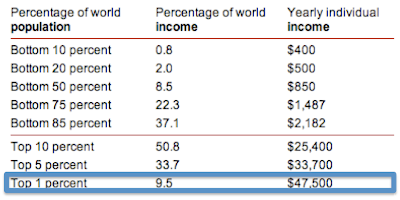
Happy Thanksgiving to the Top 1% (that probably means you)
On a day that the Dow was down 236 points, it doesn't feel like there's much to be thankful for. Between Europe's collapse, Washington's gridlock and China's slowdown, it seems the world is a dangerous place for investors. Despite all the scary headlines, there is of course lots to be thankful for, even from an economic standpoint. Most notably: we are a nation of 1%-ers.
The Occupy Wall Street movement has drawn plenty of attention to the income distribution within the United States, pitting the 99% against the 1%. But what goes overlooked by these well meaning folks is that compared to the other 6.7B people on the planet, those occupying Wall Street probably don't come close to being in the 99%.
In the US it takes an income of $250,000 per year to be considered a 1%-er, but if you take the global population into the calculation, the number drops to just $47,500. Considering that median household income in the US is $50,000 per year, this means that at the very least half of Americans live in a household that earns at the 1% level. Even the US poverty line, which is set at a family of four earning less than $22,000 is not too far from being in the global top 10%.
Compared to inequity of global income distribution, the intra-US distribution is no great injustice at all. That is something to truly be thankful for.

Global Income Distribution

Data is from the World Bank.
FDIC 3Q11 Review of US Banking System
BAC may be just 15 cents shy of trading with a 4 handle, but the FDIC's 3Q11 banking report released yesterday paints a picture of the US banking system that is actually rather healthy.
Despite persistent economic worries in the 3rd quarter, US banks were finally almost fully back to 07 earnings levels. US banks earned $35.3B in the quarter compared with $35.6B in 3Q07.

On an ROE and ROA basis banks showed similar signs of healing. Even though investors continue to worry about the earnings power of banks under a new regulatory environment, returns on equity and assets continue to improve and are almost back to pre '08 levels as well.


Banks are earning these profits at much higher levels of capital as well. The US banking system is extremely well capitalized. The stress tests wont show anything different.

This is especially true because credit continues to improve. Barring another recession, banking balance sheets should continue to get better. For now, they seem to have turned the corner.

Subscribe to:
Posts (Atom)