Friday, December 21, 2012

Happy Holidays! Offbeat Holiday Stats

Dear Readers,

I wanted to thank everyone who reads this blog for their interest.  I love investing and it's fun to write these posts, but it means a lot to me that there are others out there who are enjoying the content that I've been putting together.  The blog will be in hiatus until the New Year (that's the plan at least, but I'll be around next week so there is always the possibility of a post).  I look forward to starting back in 2013 with more analysis that I hope you all will enjoy.  In the meantime I put together a list of holiday stats to entertain.  Happy holidays!

Scott Krisiloff

Holiday Statistics

Thanksgiving

· Americans eat 68 million Turkeys on Thanksgiving and Christmas (that’s 31% of the annual total)

· The average Turkey weighs 16 pounds, meaning that over 1 Billion pounds of Turkey are consumed on those days—roughly 3 pounds per capita.

Hanukkah

· A menorah burns 44 candles over the course of 8 nights of Hanukkah

· An average candle generates 250 BTUs (British Thermal Units) of energy, which means that a menorah generates 11,000 BTUs in 8 nights. That’s about equal to 0.18% of a barrel of oil.

· There are 2.9 million Jewish Households in the US. If each household lit a menorah every night of Hanukkah, the total energy content of the combined candles would represent about ~5,500 barrels of oil, enough to last a population of 10,000 Maccabees for 8 days (assuming that the Maccabees drive SUVs and otherwise consume oil at US per capita rates).

Christmas 

· 95% of Americans say they celebrate Christmas. 93% exchange gifts and get together with family. 88% put up a Christmas tree.

· Only 76% of Americans describe themselves as Christian, which implies that ~80% of non-Christian Americans celebrate Christmas.

· There are roughly 50 million kids age 0-11 in the US. If Santa spends $75 per child he would spend $3.75B on presents per year. If Bill Gates decided he wanted to be Santa Claus, his fortune would last for ~16 years at that pace.

New Year’s

· ~30% of all champagne sales take place in the last 2 weeks of the year. That’s ~300 million glasses or 1.25 glasses per working age US population.

HAPPY HOLIDAYS! 

Thursday, December 20, 2012

How Often is the Dow Negative in May?

I may be getting a little ahead of myself here, but since the Santa Claus rally has been in full effect in 2012, I'm starting to think about the next time that the markets will hit a seasonal turning point.  The next big seasonal mile marker is when we are supposed to "sell in May and go away" 5 months from now.

In the recent past following the adage has been pretty effective.  The Dow has been down 3 years in a row in May, and 4 of the last 5.  In fact, even in 2009 when the market was rallying from the depths of the bear market, the index did take a breather around May.

The fact that seasonality has held so well in May got me to thinking about how and when the streak could end.  After all, in the 113 year history of the Dow, May is only negative a little over 50% of the time.  So will 2013 be a year to shirk seasonality?

Below is a chart that can perhaps help provide some guidance.  It shows the length of Dow losing streaks in May.  There have been three times that the Dow was negative in May for more than 3 years in a row.  The longest streak was between 1965 and 1971 when it was negative 7 years in a row.


Wednesday, December 19, 2012

Critique of Monetary Realism

I've recently been fairly active on the message boards at Pragmatic Capitalism, which is a great site put together by the very talented Cullen Roche.  The folks at Pragcap subscribe to a theory of money called "Monetary Realism," which you can read more about at their site.  

Typically I try to only explicitly and actively voice my opinion on my site through my monthly investment letters; however monetary philosophy is something that I think is crucial to understanding the investment environment, and I've generated a lot of content at Pragcap which I think is important to share with my readers here.  

The basic framework of monetary realism is that the monetary system consists of "inside money" issued by private banks as deposits and "outside money" issued by central banks as currency and reserves.  The philosophy contends that a private banking oligopoly is outsourced the right to create money by the US government.  "Outside money" is only in existence to facilitate the clearing of transactions made with "inside money."

I disagree with parts of the philosophy, I agree with other parts of it, but my main frustration lies in how it defines its terms and the narrow prism through which it attempts to describe the monetary system.   It arbitrarily draws lines where they don't need to be, and my sense is that the bulk of that is because of disagreements with a predecessor theory called MMT, which has its own shortcomings.  Below is a comment which I posted this evening that sums up my important criticisms of the framework.  Presented un-edited:

(in response to a previous comment)

After thinking some more about the issue of non-banks creating inside money I am willing to acknowledge that I am wrong to say that anyone has the ability to create “inside money” as MR defines it. In trying to incorporate MR’s framework and definitions into my framework for looking at savings markets, I erred and do see that banks are the only entity that can create deposits. We are now 100% in agreement on this point. Deposits are the sole domain of the commercial banking system. This explains why deposits are created when a bank buys a security but not when a non-bank individual buys a security.

The reason that I said that non-corporate entities could contribute inside money was based on my intuition that there is clearly net financial value created outside of the banking system in securities markets, which can be converted to deposits. If I buy an equity security which appreciates in value, net value is being added to society. If a company issues a corporate bond, a net savings product is being added to society. In attempting to draw a link between deposits and securities as a savings mechanism I do concede that I overextended the ability of securities markets to unilaterally effect the banking system.

However, this does not change the fact that I continue to believe that the MR framework is incomplete as a description of the modern monetary system because of the lack of incorporation of the bulk of the way that modern households do store their wealth. Empirically deposits are not the primary way that Americans save. In order to spend savings it is true that a crucial step is to clear through bank deposit markets. However, this clearing step should hold no more significance to aggregate economic purchasing power than the interbank clearing process via what MR refers to as “outside money.” Both are facilitating transactions based on purchasing power that is not dictated by the quantity of deposits held within the commercial banking sector.

To the extent that a monetary framework should describe the aggregate purchasing power and savings of a society, a truly modern paradigm for the US must include the securities markets as a centerpiece. As of March 2012 an average American household holds 15% of their financial assets as deposits. Any attempt to describe the liquid purchasing power of American households must include the other 85% of their financial holdings, which can easily be converted to bank deposits.

At the other end of the money spectrum lies USD. What is USD? I will continue to contend that the US dollar is the sole domain of the US government and that quantity in circulation does not matter only that it does have a specific value. It is a yardstick of economic value. There doesn’t need to be enough yardsticks to measure everything in the world to define what a yard is. The yard is a clearly defined unit of measurement endorsed by a) the government, but more importantly by b) the people and convention. The USD is no different, and derives its direct value from the quantity of the liabilities on the Fed’s balance sheet relative to the value of the assets on that balance sheet. This is no different from a foot deriving its base from a monarch’s forearm. A foot is “backed” by the length of the king’s forearm. Importantly although the size of the monarch’s forearm may change from monarch to monarch and the numerical value of feet from my couch to my door may change, there is nothing that the unit of measurement can do to change the real physical distance that I observe.

So where do deposits fit in this framework? They are a specific type of security which has a value generally equal to 1 USD. They are backed by the assets of the issuing bank ALONE, and their value cannot exceed 1 USD, even if their uninsured value can be less than 1 USD. (Just ask uninsured depositors of Indymac bank).

Deposits are a type of security. USD is a type of security. Corporate Bonds are a type of security. Equities are a type of security. All have an issuer and a holder. None is “ruler” of any other. All are means of saving. All have tradable value in relation to each other. All are “money” in some sense. Only one is USD.

Tuesday, December 18, 2012

2011 Dogs of The Dow Performance in 2012

With the year winding down and Bank of America up nearly 100% for the year on today's move, I thought it might be a good time to revisit how all of last year's Dogs of the Dow have done in 2012.  Thanks to Bank of America's huge gain the 10 worst performing stocks of 2011 have averaged a 10.5% return in 2012, 2.2% better than the rest of the Dow.  However, if you strip out BAC's gain the performance is less than stellar.  On average the other 9 stocks have returned only 1.3% this year.

Dogs of the Dow Performance 2012

Monday, December 17, 2012

What Does it Say That Samsung and Apple Have Roughly the Same Multiple?

It seems interesting that according to data pulled from Bloomberg's site Apple and Samsung are trading at virtually the same earnings multiple.  One would think that if Apple is losing share to Samsung then Samsung would have a higher multiple.  Samsung has been advancing as Apple has declined, but given the low multiples across large cap tech, does Apple's decline say more about the company or the industry?


Friday, December 14, 2012

How Long Can Real Interest Rates Remain Negative?

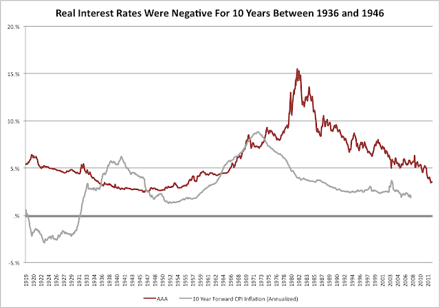
Ray Dalio made some news this week when he acknowledged that interest rates had probably gone about as low as they could possibly go and that the next big opportunity will be shorting the bond market.  I'm inclined to agree, but there is some historical precedent for rates to go lower and stay there for even longer.

Dalio argued that real rates are currently negative (nominal rate minus inflation)--which they are--but they were also negative for 10 years between 1936 and 1946 as shown by the chart below, which compares Moody's average Aaa bond yield to the realized 10 year forward inflation rate.  Inflation was high during this period, reaching above 10% in some years thanks to WWII.  The fact that rates stayed low is a testament to the fact that it's not a good decision to try to fight the Fed.

Real Interest Rates Negative World War II
Used Aaa bonds as proxy for risk free rate.  Source: Federal Reserve Data

Thursday, December 13, 2012

Why the Monetary Base Matters

Below is a comparison of the monetary base and CPI since 1918.  Each series has been indexed so that the value is 100 starting in 1918.  The data is also presented in logarithmic scale so that it's easier to interpret rate of change.  I'll admit there's not a lot of science involved in this analysis, but eyeballing the chart it's fairly clear that inflation and monetary base growth are highly correlated.  Although the series diverge in the late depression/WWII era, they generally exhibit a similar pattern with a slightly lagged increase in CPI following an increase in the base.


If the two series are re-indexed to 100 in 1945, the relationship is even more clear.  Between 1945 and 1983 CPI increases at almost the exact same pace as the monetary base.  In January 1983, when the two series diverge, the CPI calculation was adjusted to substitute a survey of "owner's equivalent rent" for housing prices.  Further adjustments were made under the Clinton administration which slow the pace of CPI growth.


Since 2008 we are seeing another divergence in the relationship between CPI and the monetary base, but as I've noted in other posts, the relationship of the monetary base to oil and gold remains extremely strong, which is consistent with the idea that when more money is printed it becomes less valuable.  It is likely that a commensurate increase in CPI will occur at some point.

Annual Change in Monetary Base Since 1918

After yesterday's post forecasting that we could see a 40% y/y increase in the monetary base in 2013, I thought it might be good to look at a long term chart of the monetary base to put that number into context.  Below is a chart showing the rolling y/y increase in the monetary base since 1918.  The only other time there has been such a steep increase in the US base was during the depression/WWII era during which there were three different periods of 20% annual growth in the base.


Wednesday, December 12, 2012

How Fast Should We Expect Unemployment to Decline?

To go along with the previous post forecasting when a 6.5% unemployment rate could occur, below is some analysis on how fast unemployment typically drops when we are in a period of falling unemployment.  Since 1949 there have been 10 periods of falling unemployment.  On average the unemployment rate falls by about 7 bps per month when it is declining.

Although the "scariest jobs chart ever" which has made the rounds on the internet implies that unemployment is falling at a much slower pace than it has in past cycles, in reality, we're basically in line with the average rate of decline (the unemployment rate just spiked from a lower base than it had in the past.)

Unemployment Rate of Decline

When Will Unemployment Hit 6.5%?

As part of today's statement, the Fed acknowledged that it would be maintaining the current QE rate until unemployment hits 6.5% or inflation gets out of hand (paraphrase).  Below is an estimate of when unemployment could hit that level based on an extrapolation of the current pace of decline.  Since peaking in late 2009 at 10%, the unemployment rate has fallen on average at about 6 basis points per month (.06%).  If it continues at this pace, the unemployment rate would hit 6.5% in mid 2014.

[Note that the decline has not materially picked up much pace in 2012.  In 2012 the rate declined by an average of 7bps per month.  At this pace 6.5% would occur just a few months earlier in 2014.]

Unemployment Forecast

Forecast of Monetary Base Through 2014

Well, it's official.  As was widely expected, the Fed announced today that it would increase the size of QE to $85B per month from $40B per month.  Below is an updated forecast of what the US monetary base could look like to start 2015 if QE lasts that long (for the record, my money says it wont).  At its peak growth rate, the base will increase by ~40% y/y.  Under the previously announced program the base was slated to grow by a robust 17%.  By 2015 the monetary base could be nearly 6x the size it was in 2008.


Tuesday, December 11, 2012

What Happens If Congress Refuses to Pass a Fiscal Cliff Deal?

I've recently heard a few people talk about how congress wouldn't fool around with a fiscal cliff vote because it learned its lesson after it failed to pass TARP, which caused the market to fall apart.  While it may be true that congress is still scared from 2008, it's not entirely true that securities markets fell apart after the first TARP vote failed.  In actuality neither the Lehman bankruptcy nor the failed TARP vote precipitated the bulk of 2008's equity market collapse.  Counter to the historical narrative, the real crash came after TARP was passed.

Lehman announced its bankruptcy on Sunday September 14th and the market was actually up slightly the following week on rumors of TARP.  When congress initially refused to pass TARP, the Dow did fall by 777 points on the day, but recovered more than half of those losses the next day.  In fact, the S&P 500 was down less than 10% from the beginning of September until TARP was passed.  

The market crash began in earnest the day that congress passed TARP.  Between that day, October 3rd, and the 2008 low on November 21, the S&P fell 36%.  After a 20% rally into December, it would continue falling until March of 2009.


Is Tax Selling Causing Apple's Decline?

In recent weeks, there has been talk that part of Apple's 23% decline may be due to the fact that capital gains taxes are likely to go up in 2013.  The logic goes that since many Apple shareholders are sitting on large capital gains, they are selling to lock in a lower tax rate.  If that logic were true one would expect to see similar selling in other top performing stocks, but on average other top long term holds have not seen the same decline that Apple has.

In October I posted a list of the top performing stocks since October 2007--stocks which should have large embedded capital gains liabilities.  The chart below compares their performance since the election.  It turns out that on average these stocks have continued to do better than the S&P 500 since November 6.  This basket has outperformed the S&P by 2.8% since then.

Capital Gains Effect on Stock Selling


Monday, December 10, 2012

What Happens To Japanese Government Interest Expense if Rates Rise?

Recently there has been more talk that the Bank of Japan would increase its asset purchases again in order to create inflation there.  Given the high level of government debt in Japan, increasing inflation and rising interest rates could cause some unique problems.  In particular, rising rates would mean rising interest expense for the Japanese central government.

Currently the government spends about ¥9.8T on interest expense, which works out to about 1.23% on ~¥800T in aggregate debt.  At that level of debt, every 1% increase in the government's interest rate means another ¥8T in expense.  This implies that at a 5.2% average rate, interest expense would exceed current receipts of ¥42T.

Japan Government Debt


It's important to note that this analysis doesn't take into account the tenor of the current debt load.  Since ¥440T has a maturity of 10+ years it would take some time for interest expense to match any increase in market rates.  I also haven't modeled in any changes in the aggregate debt load.

Thursday, December 6, 2012

December 2012 Investor Letter

Below is a letter that is written monthly for the benefit of Avondale Asset Management's clients. It is reproduced here for informational purposes for the readers of this blog.

Dear Investors,

November was the wildest month for equity markets since…last November. The S&P 500 was down as much as 5% mid-month, but managed to finish slightly positive thanks to a late month rally. One might recall that this is nearly identical to the trading pattern of November 2011, when the S&P 500 was down by 7.5% mid month, but finished down only slightly. That reversal was the beginning of a five-month-20%-rally for stocks. Let’s hope that the pattern continues to hold.

Certainly there are plenty of reasons why we shouldn't have a repeat of last year though: the fiscal cliff hangs over the market, earnings growth has been slowing, Europe is still unresolved and China has lost some of its shine. But there was lots of gloom this time last year too, and that didn't impede a big rally. As I've written before, one of the only things I can guarantee investors is that the market will swing between times of extreme optimism and extreme pessimism. Counterintuitively, pessimism is actually what tends to propel the market higher, because when people become so focused on what’s wrong with the world it creates an opportunity for known problems to be solved rather than new problems created.

Right now the problem that everyone is focused on is the fiscal cliff. For most of the year I have focused on this problem as well, but after further analysis I’m glad to write that I think the cliff could be more manageable than the market currently expects. Ultimately the cliff itself is a bit of a red herring because the alternative to the cliff is a compromise, which means higher taxes and lower spending (just like the cliff). Either way there is going to be deficit reduction in 2013. This is “bad” to the extent that it means a removal of short term stimulus, but in the “worst” case circumstance the deficit would be reduced by about $45B per month, which is almost exactly the same amount of money that the Fed will be providing to the economy via QE3. The Fed is doing everything it can to create a monetary cushion to land on in the event that we hurl ourselves over the cliff. In the short term, I think there is a good chance that it could work.

Two caveats: 1) there is a strong possibility that going over the cliff could be so damaging to market psychology that it won’t matter that the alternative wouldn't have been much different. 2) What’s good for the short term is not necessarily good for the long term. Deficits boost the economy today, but both fiscal and monetary stimulus must be reduced at some point. The US economy cannot exist in a state of perpetual economic stimulus, and the true cliff will come when congress addresses entitlements and the Fed stops printing money. Those ideas aren't even currently part of the national dialogue, which is far from positive. The “good” news is that for now market participants will likely continue to ignore the elephant in the room and bid securities prices higher. The bad news is that the more we ignore it, the bigger the elephant will be when we are finally forced to deal with it. Alas, all this is for another day.

In terms of our portfolios, I’m happy with how we are navigating this period. In the middle of last month, we reinvested a sizable portion of our cash position and were able to benefit from the pullback by buying some really good companies at favorable prices. As long as we continue to do this, I feel confident that we can continue to do well in a variety of investment environments.

Scott Krisiloff, CFA

Opinions voiced in the letter should not be viewed as a recommendation of any specific investment. Past performance is not a guarantee or reliable indicator of future results. Investing is subject to risk including loss of principal. Investors should consider the suitability of any investment strategy within the context of their personal portfolio.

Non Performing Loans at US Banks

Despite concerns about the fiscal cliff, it should be encouraging to investors that bank stocks have held up quite well over the last couple of months.  It seems that sentiment may have finally turned for the group, especially for Bank of America, which regained the $10 level yesterday yet still trades for a little over 50% of book value.

The banking system has healed a lot since 2008 and profitability has almost returned to old highs.  However, non-performing loans remain piled on US banks' books and probably will stay there for years to come.  According to recent FDIC data, non performing loans (NPL) as a percentage of all loans at FDIC insured banks are still higher than they were at the peak of the S&L crisis.  

While it's an interesting data-point, this isn't necessarily cause for alarm because NPLs are supposed to be written down to fair value when they go to non-accrual status.  This means that as long as housing prices remain stable, these loans probably wont have to be written down any more.  Also, just because a loan is marked as NPL doesn't mean that it's not still paying.  In fact, many of these loans are probably still generating cash flow for the banks that hold them.

Non Performing Loans

Wednesday, December 5, 2012

After an Iconic CEO Leaves

Since Apple is having a particularly rough day today, I thought it would be worth reposting something I initially posted in August 2011 when Steve Jobs officially stepped down as CEO.  It's a comparison of DIS, WMT and MSFT after their iconic CEOs departed.  Looking at DIS and WMT, each of those companies continued to be top stocks for 5-6 more years.  MSFT underperformed the S&P but greatly outperformed the Nasdaq after Gates left.  Can AAPL's outperformance last as long?  It's gone about a year and a quarter without Jobs and until recently has remained a strong stock, but perhaps tech is such a rapidly changing space that the benefit of Jobs' vision has less longevity.

--

Originally posted 8/25/11:

With Steve Jobs stepping down at Apple, there are plenty of questions about what comes next.  Jobs is undisputedly the most influential CEO of the last decade and one of the most influential people of the last 35 years.  Jobs' contributions to society have been extraordinary and today he is deservedly drawing comparisons to other great industrialists like Ford, Edison, Carnegie and Rockefeller.  When the history books are written, it's likely that these comparisons will hold up.

While I wanted to run a stock chart comparison to these early 19th century industrialists, individual stock data from the early 20th century isn't easy to come by.  Still, there are at least three iconic CEOs of the latter 20th century who can arguably be compared to Jobs: Disney, Walton and Gates.  Here's a look at how each company's stock performed in the decade following its CEO's departure.

Each chart begins on the date that the CEO stepped down.

DIS

Click to Enlarge

WMT


MSFT


What's striking is that in the case of DIS and WMT, each stock continued to massively outperform the S&P 500 for 6 and 5 years respectively after the departure Disney and Walton.  Perhaps this is a testament to the bench of talent that a great CEO cultivates.  However, after the 5-6 year mark, both stocks had prolonged periods of underperformance (for DIS at least partially due to the 1974 bear market).  This may be an indication that a visionary CEO can continue to carry a company for years after leaving, but after a while, the company loses the benefit of that vision.

Of the three companies, only MSFT has underperformed the S&P 500 from the day that Gates stepped down.  Of course at least part of this has been because of the collapse of the tech bubble (MSFT was trading at about 60x earnings at the time).  Still, looking at the underlying earnings of MSFT and the gross mismanagement since Gates left, it is a testament to Gates' leadership that the company continues to enjoy top market share in the PC business.  

Another primary reason for MSFT's poor performance has been because of the efforts of Jobs himself who arguably engineered an organic monopoly in high end consumer electronics.   He will be missed for his vision, but we may not really know how much we miss him for another 5 years.

Tuesday, December 4, 2012

Corporate Bond Issuance Since 1996

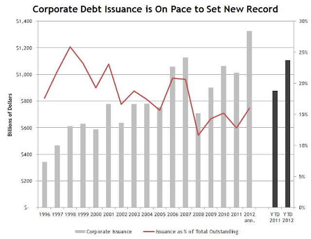
With interest rates at record lows and possible tax changes on the horizon, a number of companies have been accessing corporate debt markets and using the proceeds to alter their cap structure.  Today, Intel was the latest company to announce a debt offering to repurchase shares after that stock has fallen more than 30% since May.

One of the goals of maintaining a zero interest rate environment is to encourage consumers and companies to take actions like this.  The Fed is trying to push the economy to re-lever.  So far, it has had mixed success in this pursuit, although borrowing has begun to pick back up in 2012.

As far as corporate debt securities go, 2012 could be a strong year.  US companies are on pace to issue $1.3T in new debt into securities markets (through October).  This would be a new all time high and is already more than was sold in all of 2011.  As a percentage of corporate bonds outstanding though, that number is still lower than in the late 90s--only 16% vs over 25% back then.  It's almost double what was issued in 2008 when credit markets froze though.

Bond Issuance per Year
Source: SIFMA

Monday, December 3, 2012

US Auto Sales

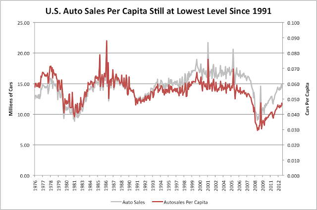
US auto sales continue to rise in recent months, which is causing a fair amount of excitement about the possibility of a hot auto market.  High ticket items like cars can be big contributors to GDP, so from an economic standpoint the data is very encouraging.

Still, from a historical standpoint, auto sales remain relatively weak.  If 15m vehicles were sold (annualized) in November, the rate is still below the average rate during the mid 2000's when there were closer to 17m cars sold per year.  

On a per capita basis, the number looks even more depressed.  As of October we were selling 0.047 cars per person per year in the US (~1 car for every 21 people).  Outside of this recession, you'd have to go back to the lowest point of the 1991 recession to find a similar per capita rate.

US Auto Sales

Friday, November 30, 2012

Bank Reserves at Federal Reserve

Over the last several years, many analysts have argued that QE isn't inflationary because the money that the Fed has printed has been locked up in reserve balances.  I don't personally share this view, but it's worth noting that recently reserve balances have been contracting and currency in circulation has been growing as banks have chosen to convert reserves to currency.  Currency in circulation is now growing at nearly a 10% annual rate.


QE3 Just Starting to Hit Fed Balance Sheet

Although QE3 was announced almost 2.5 months ago, the mortgages that the Fed has been purchasing have only just started to hit the Fed's balance sheet over the last couple of weeks.  The monetary base has continued to hold flat, but mortgage holdings have ticked ever so slightly higher.

The Fed has agreed to purchase ~$100B worth of mortgages since September, but holdings have only increased by $40B due to the lag in time of settlement for MBS trades.  The fact that the balance sheet has mostly been unchanged suggests that we may not yet have seen the effects of QE3 in securities markets.


Thursday, November 29, 2012

Nominal GDP Grew at 5.5% in 3Q12

The first revision of 3Q12 GDP was released this morning and showed that GDP grew at 2.7% annualized during the quarter, which was 0.7% better than the initial estimate.  That's also 1.4% more than it grew in 2Q12, when it only grew by 1.3% annualized.

People often forget that the headline GDP number is reported on a "real" basis, which means that it is adjusted for inflation.  In reality, real GDP is anything but real though, since the world is measured in nominal, not real numbers (especially important for debt), and economists do a debatable job of measuring inflation anyways.

On a nominal basis GDP was up 5.5% annualized last quarter, a pretty big number!  The deflator (inflation) ran at 2.7% which is also a fairly large number in its own right.  The 5.5% growth was actually the largest quarterly increase in nominal GDP this cycle, although it's not quite as large as it was at other points last decade.

Nominal GDP Growth
Source: BEA

Wednesday, November 28, 2012

Largest Powerball Jackpots in History

Tonight the lucky residents of 42 states (sadly not California) will get a shot at a $500m Powerball jackpot.  Below is a chart of all the times that the jackpot has exceeded $200m.  This has happened 28 times since 2002, about once every 134 days, or 2.7x per year.  That isn't a whole lot different than the frequency of drawdowns on the S&P 500, which, like big jackpots, create favorable buying opportunities.  Five percent drawdowns have happened about once every 163 days since March 2009.


Tuesday, November 27, 2012

Is [The] Santa Claus [Rally] Real?

The end of this week will bring the end of November, and with that there is the usual seasonal talk about a Santa Claus rally in the stock market.  The logic goes that stocks usually rally between Thanksgiving and Christmas, but much like with Kris Kringle himself, it's fair to ask the question: does the Santa Claus rally really exist?

Looking at the historical data, since 1957 December has been a positive month on average for equities.  In the past 5 years it has been especially good--powered by a nearly 11% gain in 2008 and 4% gain in 2010.  Below is the average path that the S&P 500 takes during December.  It demonstrates some Christmas magic may indeed exist--the path is even strangely sleigh like...


Monday, November 26, 2012

S&P 500 Down Just 0.21% In November

Even though we're set to open slightly lower this morning, the S&P 500 is hardly down at all for November.  This is amazing considering that it was down as much as 5% mid month.  The pattern is similar to 2011, when the S&P 500 was down by 7.5% mid month, but ended it down only 0.5%


Wednesday, November 21, 2012

Happy Thanksgiving to the 1% (That probably means you)

I'm re-posting this post from last year--I haven't changed a word.  It's easy to forget that there was extreme bearishness then too, but after Thanksgiving 2011 we got a 5 month rally from ~1150 to ~1400.  A similar rally this year would bring us to new all time highs.

Originally posted 11/23/11:

On a day that the Dow was down 236 points, it doesn't feel like there's much to be thankful for.  Between Europe's collapse, Washington's gridlock and China's slowdown, it seems the world is a dangerous place for investors.  Despite all the scary headlines, there is of course lots to be thankful for, even from an economic standpoint.  Most notably: we are a nation of 1%-ers.

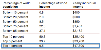
The Occupy Wall Street movement has drawn plenty of attention to the income distribution within the United States, pitting the 99% against the 1%.  But what goes overlooked by these well meaning folks is that compared to the other 6.7B people on the planet, those occupying Wall Street probably don't come close to being in the 99%.

In the US it takes an income of $250,000 per year to be considered a 1%-er, but if you take the global population into the calculation, the number drops to just $47,500.  Considering that median household income in the US is $50,000 per year, this means that at the very least half of Americans live in a household that earns at the 1% level.  Even the US poverty line, which is set at a family of four earning less than $22,000 is not too far from being in the global top 10%.

Compared to inequity of global income distribution, the intra-US distribution is no great injustice at all.  That is something to truly be thankful for.


Global Income Distribution

Data is from the World Bank.

Tuesday, November 20, 2012

HP's Horrible Acquisition Track Record

As I'm sure most are aware, HP announced today that it would be writing-off almost the entirety of its Autonomy acquisition, which was panned from the minute it was announced and resulted in Leo Apotheker's ousting.

In acquiring Autonomy, HP basically admitted that it set fire to about $9B.  This would be bad enough if it wasn't for the fact that this is not the first, not the second, but the third time in a year that HP has admitted that a company it spent more than a billion dollars acquiring was worth far less than it paid for it.  In 2008, HP bought Electronic Data Systems for $13.9B and wrote that down by $9.8B last quarter.  In 2010 the company bought Palm for over $1B and shortly thereafter shut the operations down.  In all the sum of these three write-downs is worth almost as much as HP's current market cap!

Worst of all, the carnage from the Mark Hurd/Leo Apotheker era still might not even be done yet.  In 2010 (while the company was being led by an interim CEO if memory serves) HP made three other multi-billion dollar acquisitions at big revenue multiples.  3COM, 3PAR and Arcsight could each be a candidate for billion dollar write-downs as well.


Monday, November 19, 2012

What Happens if We Don't Go Over the Fiscal Cliff?

One thing that I think people aren't currently appreciating about the Fiscal Cliff is that congress is mostly debating how they plan to shrink the deficit, not really if they're going to shrink the deficit.  So, whether there's a compromise or not, the US economy is going to be facing a similar picture in 2013: deficit reduction.  (Of course, if we don't "go over the cliff" this deficit reduction might happen slower than in a compromise, and certainly a lack of compromise wont be good for market psychology, but from a technical spending point of view the outcomes are actually rather similar.)

In order to take a look at how the US economy has fared in past periods of deficit reduction, below is some important data linking GDP growth to deficit contraction.  The chart shows the data for every year that there has been a contraction in the deficit as a percentage of GDP since 1929.

Over that time frame there have been 42 years that the government has spent less money relative to GDP than it did in the previous year, and the good news is that in the vast majority of those years, there has still been positive GDP growth.  Real GDP only contracted in 7 of those years and Nominal GDP only contracted in 3 (two of which were in the depression).  The reason that nominal GDP has fared better is that there is actually a strong history of inflation in years of deficit reduction--something to definitely watch for in 2013.

What Happens to GDP when Deficits are lower
Source: Federal Reserve


If the deficit shrinks by the full fiscal cliff amount of ~$500B next year, that would mean that the deficit would shrink by ~3% of GDP.  Below is some data to put that into context relative to other years in which the deficit contracted by a large amount in a single year.  Many of the data points are clustered around the post WWII period (when we ran our largest deficits captured by the data), but low real GDP growth and high inflation are characteristic of most of these years.

Deficit Reduction GDP

Friday, November 16, 2012

Federal Debt Compared to Household Net Worth

Much of the recent discussion about the fiscal cliff has focused on the role of the wealthy and their obligation to shoulder the public debt load.  With the debt at $16T and the relative concentration of wealth in the US, the wealthy might not ultimately have much of a choice.  The top quintile of wealth is going to have to shoulder almost all of the load.

America is a wealthy country, so technically there is enough money to extinguish the whole debt if we needed to, but it would likely take extending the scope of taxation beyond income and into wealth.  The savings rate in the US ("leftover" income) is already very low, so there isn't a whole lot of room to tax income more without severely impacting consumption.  There is, however, plenty of wealth, but it happens to be highly concentrated because low income households don't save much.  The top 20% of households hold 85% of the country's net savings.

Below is a chart of what the richest Americans' wealth looks like in relation to the Federal debt.  The Forbes 400 could only cover ~10% of the total.  The top 1% could cover the whole amount, but it would require a one time tax of 71% of their net worth (which includes assets like real estate, which would be tricky to implement).

If Uncle Sam wanted to keep a hypothetical debt extinguishment tax to 30% of an individual household's net worth, it would have to extend the tax across the top 20% of households, which would include households with an average net worth of ~$700k (that works out to ~210k for that household).

Source: Federal Reserve, Avondale Estimates of Net Worth Based on 2007 Wealth Concentration Statistics.
Importantly this analysis only includes today's debt.  It does not take into account the unfunded liabilities from social security and medicare.  It's a little scary to think that the majority of American households have almost no savings and will be absolutely dependent on these programs as elderly.  These two programs combined are estimated to have an NPV liability of ~$50T, which theoretically wipes out the net worth of the whole top 20%.  Before anyone goes into crisis mode though, all that really means is that something will have to change over time.

Thursday, November 15, 2012

Employment and Competitiveness of Small Businesses

During the presidential campaign there was a lot of talk about the role of small business in employment.  One of Romney's central theses was that the small business community is the largest creator of new jobs in the country and so we should give small businesses breaks to allow them to hire.

In actuality, small businesses may create new jobs but they aren't the largest employer in the country.  Large companies with more than 500 employees employ slightly more than half of all working Americans, while firms with fewer than 100 employees collectively employ about ~30% of the workforce.  Still, smaller firms are more labor intensive than large firms in that they spend a higher share of revenue on labor.   Mid sized firms employing between 10-100 workers spend over 20% of revenues on their workforce.  By contrast, large firms only spend 15%.  (I'd guess the reason 1-4 employee firms looks relatively low is that the majority of income is proprietor's income rather than payroll).

Source: Census Bureau


Even though they employ fewer people, there are many more small businesses in terms of number of firms.  However, since 1988 the average number of employees per firm has risen steadily (see below).  This implies that there's been consolidation in the economy and the average size of US businesses is increasing.  Today there are 5.7 million firms in the US, which is down 5% from the start of the recession.  By category, the number of businesses with 20-99 employees shrank the most over this time frame, falling by 11% since 2007.

One might wonder if the business landscape has trended towards consolidation because of the labor intensity of smaller firms. Larger firms have the resources to spend on technology and globalization of supply chain, which improves efficiency and allows bigger companies to take share from smaller ones.  One could probably argue in different directions as to the effect this has on the aggregate labor force, but the fact that large firms spend a smaller proportion of revenue on labor raises some underlying questions about the extent to which today's elevated unemployment is structural (vs. cyclical)--caused by the elimination of jobs through increased implementation of technology and business consolidation.

Source: Census Bureau


Katrina's Effect on Jobless Claims vs. Sandy

Before Sandy hit I mentioned that jobless claims would be one of the more sensitive economic indicators to any disruption caused by the storm.  Checking back in, today we found out that jobless claims spiked 78,000 following the storm to 439,000.  In 2005, claims rose by 96,000 after Katrina hit and it took six weeks for claims to fall back to their previous level.


Wednesday, November 14, 2012

S&P 500 Historical Annual Performance vs. Dow

After today's selloff, the S&P 500 is up 7.8% for the year (ex-dividends) while the Dow is only up 2.9%.  This means that the S&P 500 is outperforming the Dow by 490 bps, which seems like a lot given that the indexes are both large cap indices.

Still if the indexes ended the year with this performance, it wouldn't be the largest historical spread between the two.  In 55 years of S&P 500 history, there have been 10 years that it has beaten the Dow by more than 5% (ex-dividends).  There are also 9 years that the Dow has beaten the S&P 500 by the same spread.


Makes you think--what's the point of benchmarking active managers if even similar benchmarks outperform one another from year to year?

Seasonality of Business Inventories

Business inventories were reported today up 0.7% for September which is slightly higher than expected.  Inventories are an important economic data point to watch because GDP growth is highly sensitive to expansion and contraction in inventories.  Currently, the inventory to sales ratio is at 1.28x which is slightly higher than it was to start the year.  This is something to keep an eye on because if inventories rise faster than sales, there can be an inventory liquidation and a corresponding contraction in GDP.


Cyclically speaking, inventory data is important to GDP but is somewhat difficult to interpret because it is also affected by secular and seasonal variance.  On a secular basis, businesses have found a way to continually become more efficient and reduce inventory over time.  This makes it difficult to interpret what the "right" level of inventory/sales should be.

Seasonally, inventories will also shift in response to the holiday shopping season.  The government data is supposed to be adjusted for this, but is imperfect.  On average since 1992, inventories are ~6% higher in November than they are to start the year.  This year, inventories have grown a little more than average since January.  (Note that it's important not to read too much into whether that means that companies are "over-inventoried" because the chart is really just showing the seasonality in any single year.)


Tuesday, November 13, 2012

5% Pullbacks Since the Start of The Bull Market

With the S&P 500 at 1384, we're currently more than 5% off of the most recent high for the S&P 500.  This marks the 9th time since the market bottomed in March of 2009 that the S&P has had a draw-down of at least 5%.

Below is a list of all the times that the market has experienced at least a 5% pullback over the last ~4 years along with the duration of the pullback in terms of number of trading days to the bottom and number of trading days to the next peak.

The most recent pullback hit its lowest (closing) point 38 trading days into the draw-down, which is slightly longer than the average during this bull market (although the data is not exactly normally distributed).

Market Drawdowns S&P 500
Note: expressed in trading days

Monday, November 12, 2012

Have Top Performers Led the Recent Market Decline?

The S&P 500 is down a little over 5% since September 14th, and it feels like the decline has been led by some of the best performing stocks of the last few years.  Apple is down 21.5% over that period, Chipotle down 25% and Monster Energy down 15%; these are just some examples of high fliers that have been hit hard over the last two months.

While it feels like there are a lot of high profile companies that have declined recently, in actuality the best performers since since 2009 have done slightly better than the market since September, while the worst performing stocks since '09 have continued to do poorly.


Thursday, November 8, 2012

Checking Back in on 2006 vs. 2012

Early this year (back on January 4th) I posted that 2009, 2010 and 2011 had followed the pace of the 2003, 2004, 2005 rally almost perfectly.  Since then we've been checking back in periodically to see how well 2012 has paced 2006.  The pattern has actually been eerily similar except for the fact that the pace of the rally that came off of the summer lows was slightly faster than in 2006 and reached a higher high.  The recent 5% pullback has corrected for that though, and now 2012 looks almost exactly like 2006 again.


Wednesday, November 7, 2012

Are we Heading For a Recession?

Every time the equity markets go through a correction the recession chatter seems to pick up.  In the last few days, the chart below has started to pop up around the internet in support of the idea that we might be heading for one again.  It's a recession probability index (which isn't widely followed to my knowledge) but has a good track record of predicting previous recessions and is past the threshold that has signaled false alarms before.

The indicator was developed by two professors, Marcelle Chauvet and Jeremy Piger.  The inputs are: "a dynamic-factor markov-switching model applied to four monthly coincident variables: non-farm payroll employment, the index of industrial production, real personal income excluding transfer payments, and real manufacturing and trade sales."


I'm not particularly familiar with this indicator so it's tough to know what the biases could be, but I generally tend to be somewhat skeptical of models like this one.

A more time tested recession indicator is the slope of the yield curve--when the spread between 2 year and 10 year treasuries is inverted recession normally follows.  In a zero interest rate environment the yield curve may have lost some of its informational content, but it's been a great cyclical indicator for a long time and it's grounded in sound economic logic, so it shouldn't be totally ignored.  Today, even though the curve has flattened since '09 it is still not at or near the zero threshold.  As of right now I'm still on the lookout for the yield curve to go completely flat or invert when recession is imminent, even in this environment.

To clarify, I did write yesterday in my investor letter that I think recession will happen sometime in the next presidential term, but that doesn't necessarily mean it's imminent.  My base case is that it could start sometime late next year absent a totally botched fiscal cliff.  The forecast is mostly reliant on the average duration of economic expansions.  As I've written before, this expansion would be short even compared to the 1933 expansion if it ended today.


What's Wrong With the Republican Party?

I happened to catch this interview last night on NBC which is definitely worth watching.  Aside from the unfortunate phrasing "Latino problem" Mike Murphy strikes me as a pragmatic strategist who is correctly diagnosing the underlying problems for the Republican party.  Last night's election proved that Republican party conservatism is anachronistic and will be need to be revamped before 2014 and 2016 if the party wants to remain relevant.


Visit NBCNews.com for breaking news, world news, and news about the economy

S&P 500 After Obama 2008 Election

Even though November 2008 was a much different market environment than November 2012, it's worth noting that equity markets sold off pretty hard after Obama was elected in 2008 too.  The volatility surrounding the financial crisis was extreme, but leading up to the election the S&P 500 had found some footing rallying from 850 to 1000.  

Following the election the S&P lost 25% in 13 trading days.  On November 21 the S&P 500 made a near term bottom that would last until February 2009.  There was a big intra-day reversal when it was leaked that Tim Geithner would be Treasury secretary.  Four years later, as we wait to find out who his replacement will be, maybe that person could spark a rally of her/his own.


Tuesday, November 6, 2012

November 2012 Investor Letter

Below is a letter that is written monthly for the benefit of Avondale Asset Management's clients. It is reproduced here for informational purposes for the readers of this blog.

Dear Investors,

Tonight the presidential election will finally be over and the markets will have some certainty about who will be in charge of the US government for the next four years. The victor will celebrate, but I’m not sure that he should be so happy to have the job. Whoever is president, the next four years could bring some of the biggest challenges faced by an administration since Roosevelt.

The next president will have to make important decisions about the course of the public debt and deficits, which will determine the health of the American economy for decades to come. In dealing with these issues he will be forced to choose between inflicting short-term pain and risking long-term damage. Politically, neither is palatable, but real leadership requires the former. In his first term, Obama clearly chose the latter, but perhaps without the goal of re-election hanging over his head he can finally push for real change. On the other hand, if Romney is elected he will have to worry about a 2nd term and therefore may find it harder to think longer term than Obama can.

Unfortunately, either candidate will be confronted with these challenges before he’s even sworn into office. The fiscal cliff is rapidly approaching and a decision must be made about how to deal with it. If there isn’t a compromise, then recession is almost certain. If there is a short-term fix (which most expect) then maybe recession is avoided in the immediate term, but probably not for long. It’s highly likely that the next presidential term will face another recession anyways.

Statistically we should be on the lookout for one late next year, and to make matters worse, the next time recession hits, the president probably wont have the same stimulus tools at his disposal as he did in the last one. The odds are that $1T budget deficits and unlimited Quantitative Easing will be central to the cause of the next recession rather than a solution for it.

From a market perspective, next year is an eternity away though. For now, the only thing that most people care about is whether the market will go up or down on Wednesday. It’s easy to make the argument either way no matter who wins. Most market participants aren’t particularly fond of Obama, but they do love Bernanke’s QE policies, which are more likely to continue in an Obama presidency. Alternatively, while more investors would probably prefer Romney for the long term, in the near term uncertainty over QE would be extremely damaging to market sentiment.

Near term, most investors actually aren’t paying attention to a much more important force than the election: QE3 hasn’t technically hit the markets yet. The mortgages that the Fed has purchased take about 60 days to settle, so the first purchases made in mid September will begin to clear next week. Curiously, markets have gone down ever since QE3 was announced, and this is probably at least part of the explanation. We should start to see more of a boost from QE once the trades clear.

That leaves us still with lots of cash but looking to start reinvesting over the next few weeks. That cash served us well in October as markets declined, but I continue to expect the S&P 500 to get somewhere closer to 1450 by year-end. As I mentioned last month, cash becomes a less valuable commodity when the Fed prints more of it.

Scott Krisiloff, CFA

Opinions voiced in the letter should not be viewed as a recommendation of any specific investment. Past performance is not a guarantee or reliable indicator of future results. Investing is subject to risk including loss of principal. Investors should consider the suitability of any investment strategy within the context of their personal portfolio.

Monday, November 5, 2012

History of Party Control of US Congress

Apologies for back to back political posts, but it seems to be all that anyone is talking about until tomorrow is over.

Many political scientists argue that "realigning" elections happen in the US about once every 35 years.  In these elections, there is a political paradigm shift and a redivision of the electorate along new party lines.  Generally these realignments happen in conjunction with a major historical friction like the Civil War or the Great Depression.

In American history most agree that realigning elections happened in 1828 (Jackson), 1860 (Lincoln), 1896 (McKinley) and 1932 (Roosevelt).  There's some dispute about whether one happened in 1968 with Nixon or 1980 with Reagan, although I tend to believe that we're still in a system representing the vestiges of the New Deal Coalition (1932).  

Either way, it can be argued that the US political system is long overdue for a seismic fundamental shift.  I think that growing interest in Libertarianism against the backdrop of high public debt and extreme monetary policy is indicative of a bubbling change in the electorate, but while these ideas have begun to influence the conversation (e.g. through the tea party and Ron Paul), we're not at a paradigm shift quite yet.

For some perspective, below is a chart showing the history of political party control of congress.  The exact political epochs are debatable from historian to historian, but I based the labels in the graph loosely on the five party systems defined by wikipedia.

History of Political Party Control of Congress
Click to Enlarge.  Third Parties and Independents Excluded.  Data source: Office of the House Clerk

Friday, November 2, 2012

S&P 500 November Return in an Election Year

After today, there are just two trading days until a presidential winner is decided (hopefully).  The last time that an election felt as close as this one was in 2000 when Bush and Gore went head to head resulting in recounts, hanging chads and almost a month of uncertainty.

Although it's a long shot that we have a repeat of 2000 next Tuesday, there are plausible (although also low probability) scenarios in which an electoral college tie could happen.  Especially given that the fiscal cliff is breathing down congress' neck, let's hope for everyone's sake that it doesn't happen.  As a reminder though, below is what happened to the S&P for the month between the election and Gore's concession.  Funny how the S&P 500 is basically starting at the exact same spot as it's at today.

Bush v. Gore was obviously a rare occurrence not expected to repeat, so below is a list of how the S&P 500 did in November in other election years since 1952.  On average the S&P 500 is up in an election year in November, and slightly more when a one term President is ousted than when re-elected.

Note: Counted LBJ as one term President